
Sure, you can handle it. But should you?
Let our experts manage the tech maintenance while you focus on your business.
Let our experts manage the tech maintenance while you focus on your business.
Development of Insight Apps
Video Tutorial “Creating an Insight App”
This video shows you how to create your own Mindbreeze InSpire Insight App using the integrated Insight App Designer. All the functions of the standard client are explained in detail, such as improving the result list using filter and the Mindbreeze InSpire Query Language.
Link to Video: https://www.youtube.com/watch?v=2X0Ot3oXZwQ
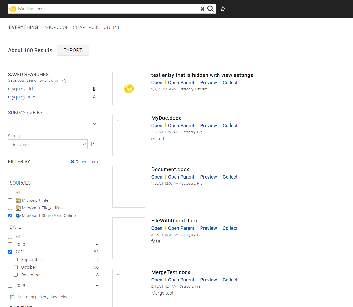
Introduction
Mindbreeze Insight Apps shape and design the access to your company's information and customize it tailored to your needs. You can use Insight Apps to display and highlight important information without the user having to search for it, to create a special search mask that is ideal for an application, or simply to set up a query targeted toward people. The possibilities are almost limitless. Indeed, the Mindbreeze Client itself is an Insight App.
Examples: Contact search, ticket search, display of recently modified documents, all information pertaining to a person, all information about a topic, embedding in Microsoft SharePoint, embedding in the intranet, embedding a web page, etc.
From a technical point of view, Insight Apps are HTML snippets that can be used on any web page.
Required resources
Head
Meta-Tags
It is recommended to specify and use the following meta-tags in the <head> area of your Insight App:
<meta name="mes:user" content="$$USERNAME$$">
<meta name="display:mes:user" content="$$IS_USERNAME_DISPLAYED$$">
<meta name="mes:emailaddress" content="$$EMAILADDRESS$$">
<meta name="mes:loginstatus" content="$$LOGIN_ACTION$$">
<meta name="mes:logoutdisabled" content="$$LOGOUTDISABLED$$">
<meta name="mes:decrypted:user" content="$$DECRYPTEDUSERNAME$$">
<meta name="app:telemetry:enabled" content="$$APP_TELEMETRY_ENABLED$$">
<meta name="app:telemetry:application:id" content="$$APP_TELEMETRY_APPLICATION_ID$$">
<meta name="app:telemetry:application:tier:id" content="$$APP_TELEMETRY_APPLICATION_TIER_ID$$">
<meta name="enablePersonalization" content="$$ENABLE_PERSONALIZATION$$">
mes:user | Username of the currently logged in user |
display:mes:user | Specifies whether the username should be displayed or not |
mes:emailaddress | Email address of the currently logged in user |
mes:loginstatus | Specifies which action is currently available for the user (login or logout). |
mes:logoutdisabled | Specifies whether the user can safely log off or not |
mes:decrypted:user | Decrypted username of the currently logged in user |
app:telemetry:enabled | Specifies whether App.Telemetry should be enabled |
app:telemetry:application:id | Specifies the App.Telemetry application ID |
app:telemetry:application:tier:id | Specifies the App.Telemetry application tier ID |
enablePersonalization | Specifies whether personalization is active |
Styles
The styles are delivered via the file adapted.css. This is located in apps/css/.
<link href="/apps/css/v2/adapted.css" rel="stylesheet">
In addition, a minimal stylesheet (minimal-adapted) is available. This file is also located in apps/css/.
<link href="/apps/css/v2/minimal-adapted.css" rel="stylesheet">
We recommend that you load these styles within the <head> in the HTML.
Scripts
The required JavaScript is supplied by client.js. This is located in apps/scripts/.
<script src="/apps/scripts/client.js" data-mindbreeze-lib data-global-export="false"></script>
- data-mindbreeze-lib: If this attribute is set, this means that the path of this resource is used for the remaining files/resources to be loaded.
- data-global-export: Specifies whether resources can be used globally or not. Default “false”
Default Libraries
The client.js is shipped with the following libraries:
Library | Key | Version | Website | Patches |
jQuery | jquery | 3.7.1 | ||
Underscorejs | underscore | 1.4.3 | CVE-2021-23358 | |
Backbone | backbone | 0.9.9 | ||
Highcharts | highcharts | 12.0.2 | ||
MomentJS | moment | 2.29.4 | CVE-2016-4055 CVE-2023-22467 | |
DayJS | dayjs | 1.11.10 | ||
RequireJS | require | 2.1.8 | ||
Bootstrap | bootstrap | 2.2.2 | CVE-2016-10735 CVE-2018-20676 CVE-2018-20677 | |
PDF.js | pdfjs | 2.0.943 | CVE-2024-4367 CVE-2018-5158 |
The libraries can now be used with the help of require():
Mindbreeze.require(["jquery","moment"], function($,moment) {
var body = $("body");
var now = moment().toDate();
});
Minimal client version
A lighter version of client.js with base components and functionalities named client-base.js exists. The size of the client-base.js bundle is reduced by more than 50% compared to the client.js.
Components removed from client-base.js:
- highcharts
- jsoneditor
- charts
- map
- table
- timeline
- queryinfo
- breadcrumb
- savedsearches
- alertedsearches
- suggestlist
- voting
- annotationPopup
- summarize
- emailalert
- emailalert_preset
- alertcenter
- feedback
Insight App Designer
The easiest way to create an Insight app is the Insight App designer. It allows you to assemble the building blocks of your Insight App using drag-and-drop. Such building blocks include layouts, search fields, results, navigation elements and filters.
Because it’s so easy to use, the designer is particularly helpful for staff specialists, enabling those who need the information to get maximum value from the data.
General
- Open the Editor: The Editor can be found at the same address as the Client, using the path apps/editor (e.g. https://example.com/apps/designer/).
- Click on the "Add Widget" button: This button appears wherever it’s possible to add widgets (more on this in Layouts).

- Choose a widget: The widget selection appears at the right edge of the window. The individual widgets are organized into thematic categories. You can add a widget simply by clicking on it or by using drag and drop.
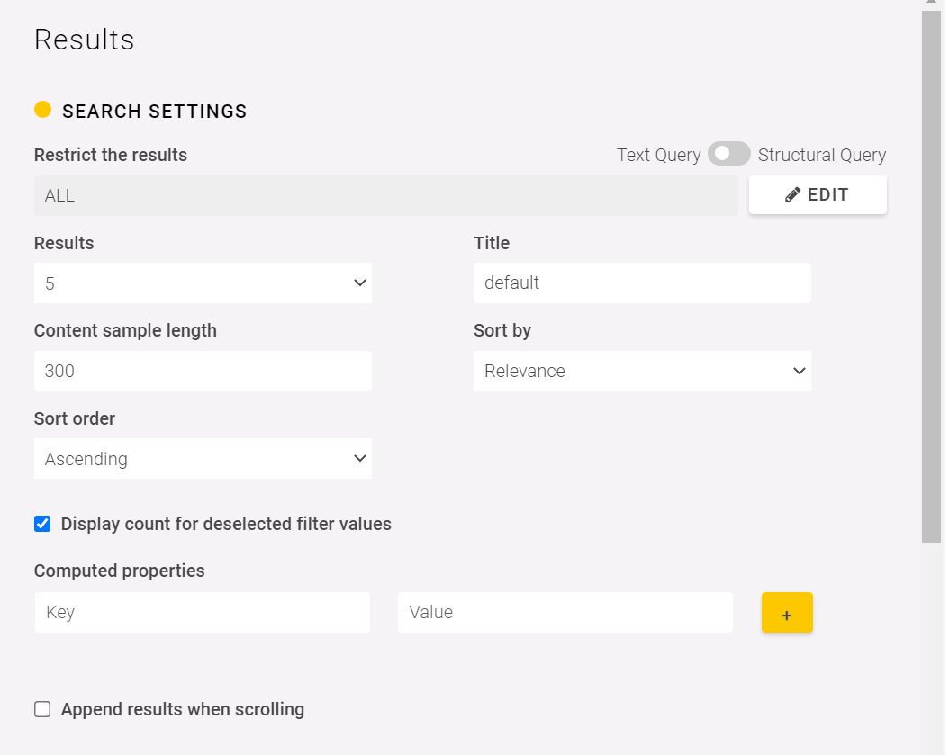
- Adjust the settings: After you add a widget, you can adjust its settings at the left edge of the window. Here you will see choices like search term, number of results and presentation template.

To edit the settings again later, use the edit buttons.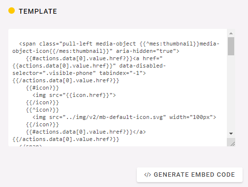
- Use the Insight App: Click the "Generate Embed Code" button and copy your newly produced snippet onto any web page.
- All done! Show your colleagues the new Insight App.
Changes in the generated HTML
Loader
The Mindbreeze Loader can be used to load the created snippet and insert it into the HTML.
Loader.loadAppFromResource(options, additionalOptions);
Application settings
options
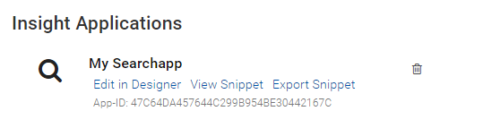
- appid: The App ID can be copied from the Management Center - InSight Apps.
- useMessageFrameForNonBuiltinSources: If set to True, the application should use legacy MessageFrame channel for application sources. Values: true, false. Default value: true.
Building Blocks
Layout
Use layout building blocks to organize the subsequent sections. You can add columns with different partitions or a header. All layouts are displayed optimally using "Responsive Web Design" both on workstations as well as on mobile devices.
Search Field
The user can type his or her own key words in the search field.
Screenshot:
Results
Lists, pictures and maps can be used to display the results.

Results settings
- Search Restrictions: Only the results that correspond to a given constraint are displayed.
Here, a distinction is made between two query types:- Text Query: (Type: String) Is used, when the input is an unparsed value e.g. ”Mindbreeze InSpire”
- Structural Query: (Type: JSON) Is used, when the input is a parsed value, so that we can implement complex constraints e.g.
{
"id": "additional_constraint",
"quoted_term": "Mindbreeze InSpire"
}
to display only documents with occurrences of the complete phrase.
Note: Whether it is a Text Query or a Structural Query is recognized automatically.
- Results: The number of displayed results.
- Content sample length: The number of characters for the preview text of a search result
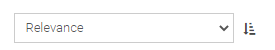
- Sort by: Results can be sorted by relevance or date.
- Sort order: The results are sorted in ascending or descending order
In List View and Picture View, the following additional options are available:
- Display results while scrolling: Additional results are automatically shown when the user scrolls down. Please Note: Enable this setting only if the results display is the last element on the page, otherwise the users cannot get to the elements under the results.
The following options are also available for the timeline view:
- Height: height of the timeline, auto for automatic adjustment to the displayed hits, or height according to CSS, e.g. 200px. Default value: auto
- Start date & end date: Limits the timeline to a specific period
In List View and Picture View, the following additional options are available:
- Template: You can customize the display of results using mustache templates. This way you can, for instance:
- Show or hide metadata,
- Customize the displayed presentation, e.g. of a person,
- Use the HTML structure of the target page.
Mustache templates
All metadata, the preview image (thumbnail) and all actions of the document are available in the template.
The following template shows the thumbnail and the title as a headline, underneath which you see the content of the document:
<h3>{{{icon}}} {{{title}}}</h3>
<p>
{{{content}}}
</p>
Enter the name of the metadata item in curly braces {{{ }}}, in order to view it. For instance:
{{{Author}}}
or
Author: {{{Author}}}
If the metadata is not available, should "Author:" not be shown either? You can make the output optional using a condition:
{{#Author?}}Author: {{{Author}}}{{/Author?}}
The complete template:
<h3>{{{icon}}} {{{title}}}</h3>
{{#Author?}}Author: {{{Author}}}{{/Author?}}
{{#content?}}
<p>
{{{content}}}
</p>
{{/content?}}
The output might look like this:
<div>
<h3><img src="..."> Dokument</h3>
Author: John Doe
<p>
Lorem impsum ...
</p>
</div>
<div>
<h3><img src="..."> John Doe</h3>
</div>
With {{#actions.data}}{{{html}}}{{/actions.data}} you output all actions. In order to access the first action only, you can use {{actions.data[0].value.href}}.
The complete template with the first action as link:
<h3>
{{#actions.data[0].value.href?}}
<a href="{{actions.data[0].value.href}}">
{{/actions.data[0].value.href?}}
{{{icon}}} {{{title}}}
{{#actions.data[0].value.href?}}
</a>
{{/actions.data[0].value.href?}}
</h3>
{{#Author?}}Author: {{{Author}}}{{/Author?}}
{{#content?}}
<p>
{{{content}}}
</p>
{{/content?}}
The output could look like the following:
<h3><a href="http://..."><img src="..."> Dokument</a></h3>
Author: John Doe
<p>
Lorem impsum ...
</p>
</div>
<div>
<h3><a href="http://..."><img src="..."> John Doe</a></h3>
</div>
Link
Your Search can be resumed in an external search engine.
Screenshot:
Settings:
- Adress: the path to the external search engine including placeholder, for example: https://duckduckgo.com/?q={searchTerms}. {searchTerms} replaces the searched term, {language} gets replaced with the language of your Insight app.
- Text: The text of the link.
Scrolling
The scrolling widget allows users to view more search results. Use this widget if you have not enabled the Show results when scrolling option for the results.
Screenshot:

For detailed information about customizing, see the pagination widget.
Pages
The page widget can be used to navigate through the search results page by page. For the results, the option “Show results when scrolling” should be disabled so that only one variant is available for scrolling.
Screenshot:

For detailed information about customizing, see the pages widget.
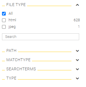
Filter
Filters are used to restrict the search results. When adding the widget, all filters that are possible for the current search are available for selection.
Screenshot:

Settings:
- Filter: The metadata that is used for the filter
- Title: If you do not want to display the standard translation of the metadata name, enter your preferred title here (but be careful if your search client is used in different languages).
- Allow user input: "Select widget automatically" adjusts the user input under the filter to its type, e.g. date input for date values, auto-completion for text values. "Disabled" hides the user input. “Use Widget” will display the widget option for user input.
- User input widget: Select the widget that will be used for user input.
- Always display user input: Should user input be displayed even if no search term has been entered yet?
- Expandable: The user can shut the filter, so that only the title bar is displayed.
- Open by default: The filter is displayed in expanded form from the beginning.
- AND operation of filter values possible: Enables a "+" button next to a filter value, which can be used to make an AND operation.
- Template: You can customize the appearance of the filter using the mustache templates.
Mustache templates
The template contains the value of the filter entry, the number of documents and whether or not the entered item is being taken into account for the current search.
Default Template:
{{{html}}}
<span class="pull-right">{{^count?}}-{{/count?}}{{count}}</span>
{{^excluded}}
{{#count?}}
<span class="pull-right">{{count}}</span>
{{/count?}}
{{/excluded}}
{{#excluded}}
<span class="pull-right">–</span>
{{/excluded}}
Values:
- html: the formatted value of the filter entry
- value: the value of the filter entry (e.g. calendar date and time values)
- count: the number of documents found for this entry
- excluded: the entry is not selected although others are
For detailed information about customization, see the filteredfacet widget.
Embedding designer
It is also possible to use the Mindbreeze Insight App Designer as a stand-alone, embedded application. As with the Insight App itself, this works in just a few steps.
Required Resources
Styles
General designer style is supplied via the designer.css file. It can be called up at the client service address under apps/css/v2/ folder.
Mindbreeze delivers also, for purpose of embedding, the designer-prefixed.css that includes prefixed selectors and only absolutely necessary rules.
<link href="/apps/css/v2/designer-prefixed.css" rel="stylesheet">
Scripts
The required JavaScript is provided by editor.js. It can be called up at the client service address under apps / scripts /.
<script src="/apps/scripts/editor.js" data-mindbreeze-lib data-global-export="false"></script>
HTML
The next step is to place the necessary HTML within a container element (root element) in the HTML. A corresponding element with the ID “designer-container” is suitable for this.
<div id="designer-container"> … </div>
This container is necessary so that the designer can only expand in this element and has the following content (can be copied and pasted):
<div id="designer-container">
<div class="mb-editor-content">
<div class="left">
<div id="categories"></div>
<div id="categoryDetails"></div>
<div id="categoryEditor"></div>
<div id="mb-actions-container" class="mb-footer"></div>
</div>
<div class="right">
<div class="infopairing-box-full mb-hidden-loading">
<div id="insight-app-container" class="mb-snippet-source">
<div class="mb-progress-bar mb-fixed"></div>
<div data-template="view" data-count="5" data-constraint="ALL"><div class="mb-component-container container" id="mb-component-container"></div></div>
</div>
</div>
</div>
</div>
<div class="mb-loading-content">
<div class="mb-loading-ring"><div></div><div></div><div></div><div></div></div>
</div>
</div>
JavaScript
The application constructor creates a search application and enables editing with the Mindbreeze Insight App Designer.
The necessary JavaScript snippet is located under the HTML elements. A new application is created here and the application edit mode is called in the callback.
Mindbreeze.require([
"client/application",
"utils/browser"
], function(
Application,
browser
) {
var options = {
startSearch: false,
rootEl: document.getElementById("insight-app-container"),
containerEl: document.getElementById("designer-container"),
callback: function (application) {
application.edit()
}
};
var sources = browser.getURLParameter("sources");
if (sources) options.sources = [ sources + "../../api/v2/" ];
new Application(options);
});
Available Widgets
The following section contains a description of all available widgets. Widgets are HTML tags that are inserted into any HTML files. HTML tags with the attribute data-template="<Widget-ID>" become widgets. Settings and templates can be defined either as additional attributes or contents of the tag.
Examples:
<div data-template="map"></div>
<div data-template="view" data-count="5">...</div>
<div data-template="view" data-count="5">
<div data-template="results" data-appendonscroll="true">
<script type="text/x-mustache-template">
<h3>{{{icon}}} {{{title}}}</h3>
<p>
{{{content}}}
</p>
</script>
</div>
</div>
accordion
The accordion widget is an element for surrounding areas which are expandable/collapsible. 
Elements included with role=tab are displayed as expandable/collapsible and can be operated using the keyboard. The widget uses the ARIA-role tab list (http://www.w3.org/TR/wai-aria/roles#tablist); the sub-elements must conform to the defined structure.
Examples:
<div data-template="accordion" data-enabled="true" data-default-open="true" aria-label="Filter">
<div data-template="datasources" data-model="userSourceInfo" data-path="sources.data_sources" role="presentation"></div>
<div data-template="constraints" data-model="userSourceInfo" data-path="sources.constraints" role="presentation"></div>
<div data-template="filteredfacet" data-name="mes:date "></div>
<div data-template="filteredfacets" data-name="mes:configuredfacets" role="presentation"></div>
</div>
Settings:
- data-enabled: Using true allows areas on the screen to be opened and closed. Default: false
- data-default-open: indicates whether the included areas are by default open or closed. Default: false
alert
An "alert" indicates errors that occurred during the search.
Screenshot:
Model: application.models.channels.alerts
Examples:
<div data-template="alert"></div>
<div data-template="alert">
<script type="text/x-mustache-template">
<div class="alert alert-{{level}}">
<button type="button" class="close" data-action-object="{"destroyModel": {}}" title="{{i18n.Close}}">×</button>
{{{message}}}
{{{error}}}
{{{warning}}}
{{{info}}}
{{#service_ids?}}
({{{service_ids}}})
{{/service_ids?}}
</div>
</script>
</div>
Mustache templates
Values:
- level: info, warning, error
- message: Error message
- error: Error message
- warning: Warning message
- info: Information message
- service_ids: Services that prompted the message
alertcenter
The alertcenter widget is an element for displaying any alerts. These alerts can either be created by the user or stored as templates by administrators. For this purpose, an e-mail address is stored for each user, to which these alerts (in case of changes in hits) are sent at the desired interval. Thus this component is an extension of the "alertedsearches" component, which will be replaced by it.
Example:
<div data-template="alertedsearches"></div>
Configuration
To use this widget, settings are required in the configurator.
annotationPopup
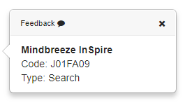
The annotationPopup widget is an element for displaying properties in the preview component by using mouse hover over an annotation. All properties from the URL that are specified as URL parameters are used. If you don't want all properties, you can explicitly specify the required properties in the mustache template (Note: These must be available as URL parameters).
Example:
https://entity.yourcompany.com/?type=Search&code=J01FA09&term=Mindbreeze%20InSpire
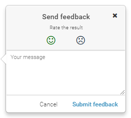
In addition, feedback can be given for each annotation, which is shown in app.telemetry:

Once embedded, it looks like this in the PDF preview:

Example:
To use this feature, the following container must be added to the client:
<div data-template="annotationPopup" data-enable-feedback="true">
</div>
Another example:
<div data-template="annotationPopup" data-enable-feedback="true">
<script type="text/x-mustache-template">
{{#term?}} <div><b>{{term}}</b></div> {{/term?}}
{{#code?}} <div>Code: {{code}}</div> {{/code?}}
{{#type?}} <div>Type: {{type}}</div> {{/type?}}
</script>
</div>
Settings:
data-enable-feedback: Enables the feedback functionality on the client. Default value: false
answers
The “answers” widget generates full-text answers from the search results found. These answers can be displayed in an Insight app in two ways:
- Answers (list of answers)
- AI Answers (answer text is generated with GenAI)
Answers
With this feature, answers to submitted questions are shown in a compact overview. Such answers are automatically displayed directly above the standard results (data-template="results") as soon as answers are available.
Requirement:
- NLQA must be configured so that answers can be displayed, Whitepaper – Natural Language Question Answering (NLQA) for details.
If answers to a specific search should not be displayed, this component can be disabled in the results template.
Example:
<div data-template="results" data-enable-answers="false"> … </div>
Settings:
- data-answers-count: To specify the number of displayed answers, this attribute can be added to the view (data-template="view"). Note that the number of answers is limited by the advanced setting “Maximum Request Answers Count” under the “Client Service” tab in the “Configuration” menu. This means that the setting data-answers-count cannot excceed the limit configured in the setting “Maximum Request Answers Count”. The default value of this setting is 5.
- data-request-properties: If this setting is active, all properties of this component are requested in the search query. Default: true. Type: Boolean.
- data-min-similarity-score: Determines the minimum similarity factor an answer must have to be displayed in the search. The default value is 50% ("0.5"). Type: String.
Example:
<div data-template="view" data-answers-count="3" data-similarity-score="0.6"> … </div>
AI Answers
With AI Answers, answers to submitted questions are shown in a compact overview, with the answer text being generated using GenAI. This makes it possible, for example, to summarize the content of several documents in one answer. The Large Language Model used to generate the answer can be defined by the admin.
The feature “AI Answers” is available in two ways:
- As a component in the building block “GenAI”
- As the setting “Create text from found responses using GenAI’ that can be activated and deactivated in the “List” component
In both cases, GenAI is used to generate an answer. Users can stop and restart the generation of the answer. In addition, the generated answer can be copied with a single click. The “Information” symbol indicates that the answer was generated with Mindbreeze AI. An overview of the sources used can be expanded below the AI Answer.
Requirement:
- A configured and functioning RAG service.
Example:
<div data-template="answers"> … </div>
Basic settings:
Setting | HTML | Description |
Generate text from retrieved answers using GenAI | data-ai-generate-text | Generate text from retrieved answers using GenAI. Default: true. |
Retrieved Context Source | data-add-answers-from-results | Defines the strategy to specify the provided answers to GenAI. Possible values:
|
Retrieved Context Limit | data-retrieved-context-limit | Limits the answers to be used in the setting “Retrieved Context Source”. |
Answer template reference | data-result-answer-template-refid | Reference to the answers template to be used by the setting “Retrieved Context Source” when using results as answers. |
LLM Prompt instruction | data-llm-prompt-instruction-text | Defines the LLM Prompt instruction. |
Use different instruction if no answers were found | data-prompt-conditional-instruction-text | If this setting is activated, the value of data-llm-prompt-instruction-text-no-answer will be used as a prompt if no answers were found. If answers were found, the value of data-llm-prompt-instruction-text is used. Default value: true |
LLM Prompt instruction if no answers were found | data-llm-prompt-instruction-text-no-answer | Defines the LLM Prompt instruction if no answers were found. |
Use custom prompt | data-use-custom-prompt | Activates the use of a custom prompt for text generation instead of the standard prompt. |
Pipeline selection | data-pipeline-selection | Determines which pipeline is used for data processing after text generation. Possible values:
Default value: key |
Pipeline | data-pipeline-selection-value | Specifies the key or ID value of the pipeline for text generation. |
Use sources from Insight App for generation | data-use-insight-app-sources-for-generation | Enables the use of sources from the Insight App to improve text generation. |
Restrict to user input | data-use-user-constraints | Activates the consideration of user input and user restrictions when generating text. |
Restrict to search constraint | data-use-source-context-constraints | Restricts the text generation to the context specified by defined restrictions. |
Preset JSON | data-conversation-input-presets-json | Preset of generate-request payload. |
Advanced settings:
Setting | HTML | Description |
Advanced Prompts | data-prompt-use-templates | When this setting is activated, the following advanced prompts with placeholders are used. |
LLM Prompt instruction with placeholder | data-llm-prompt-instruction-template | Defines the LLM prompt instruction with placeholder. |
Use different instruction if no answers were found | data-prompt-conditional-instruction-template | If this setting is enabled, the value of data-llm-prompt-instruction-template-no-answer will be used as the prompt if no answers were found. If answers were found, the value of data-llm-prompt-instruction-template is used. Default value: false. |
LLM Prompt instruction with placeholder, if no answers were found | data-llm-prompt-instruction-template-no-answer | Defines the LLM Prompt instruction with a placeholder, if no answers were found. |
LLM Prompt user message with placeholder | data-prompt-user-message-template | Defines the LLM prompt user message with a placeholder. |
Different LLM Prompt user message for no answers | data-prompt-conditional-user-message-template | If this setting is enabled, the value of data-prompt-user-message-template-no-answer will be used as a prompt if no answers were found. If answers were found, the value of data-prompt-user-message-template is used. Default value: false. |
LLM Prompt user message with placeholders, if no answers were found | data-prompt-user-message-template-no-answer | Defines the LLM prompt user message with a placeholder when no answers were found. |
data-transform-event | This is a function which can be called after every answer stream event. It should return “Promise” with the transformed text. Function arguments:
Example: var MyApplication = Application.extend({ transformEvent: function (event, application) { return new Promise(function(res, rej) { event.data.text = event.data.text.toUpperCase(); if (event.data.completeText) event.data.completeText = event.data.completeText.toUpperCase(); res(event); }) }, }); | |
Immediate reset generated answers on user input | data-clear-answer-on-change | The property controls whether the current AI-generated answer is cleared when the user provides new input. Type: Boolean Default value: false |
applists
Offers a choice of additional search sources and additional external data sources.
Screenshot:

Model: application.models.applists
Example:
<div data-template="applists"></div>
breadcrumb
When actions restrict the results, these constraints remain available in the breadcrumb widget and can be disabled there again.
Screenshot:
Model: application.models.search.user.constraints
Examples:
<ul data-template="breadcrumb" data-display-filteredfacets="true" class="nav nav-stacked nav-pills"></ul>
<ul data-template="breadcrumb" data-display-filteredfacets="true" class="nav nav-stacked nav-pills">
<script type="text/x-mustache-template" data-tag-name="li">
<div>
<label class="checkbox">
<input type="checkbox" checked data-action-object="{ "removeConstraint": {} }">
<span title="{{{description}}}">{{{description}}}</span>
</label>
</div>
</script>
</ul>
Settings:
- data-display-filteredfacets: If true, the selected facets are shown. Default setting: false.
chatframe
The Mindbreeze InSpire AI Chat can be included into Insight Apps with the chatframe component. With the AI Chat, users can find information in natural language in the form of answers. In addition to the answer, a link is also provided which gives users direct access to the source and the context of the answer.
The chatframe component can be integrated into your HTML file like this:
<div data-template="chatframe" class=" mb-chatframe-height">
When using the attributes in the HTML code, make sure to add the prefix “data” to the attribute. For example: data-constraint="ALL AND extension:pdf" .
The HTML code with attributes can look like this then:
<div data-template="chatframe " data-constraint="ALL AND extension:pdf" class="mb-chatframe-height">
CSS variables for the height of the AI Chat
The default and minimum height of the AI Chat is predefined in a CSS file. To use the CSS file, the adapted.css is needed:
- Default height: 100 vh
- Minimum height: 300 px
Attributes
The following attributes are available:
- data-constraint: Defines constraints for the AI Chat like constraining the AI Chat only to PDF documents. The constraint is defined with a query expression.
- data-height: Defines the predefined height for the AI Chat in Designer. The following values are available:
- Automatic - calculates the height whenever a resize event is triggered.
- Maximum height - height is fixed to 95vh.
- 2/3 height - height is fixed to 75vh.
- Half height - height is fixed to 50vh.
- 1/4 height - height is fixed to 25vh.
- Default value: Automatic
- Important: The attribute data-height also accepts values in %, em ,rem and px if it sets from outside. By using the option “Automatic” the height will be calculated automatically.
- data-show-model: Defines if the Large Language Model (LLM) that is used for the generation of answers is shown in the AI Chat. Can be switched on and off.
- data-show-side-navigation: Defines if the side navigation should be visible or not. The side navigation shows a list of all created chats.
- Available settings: True, False
- Default setting in Insight App Designer: True
- data-use-user-query: Defines if the AI Chat should use the user query from the search request.
- Example: The user searches for “What is a connector?”. The AI Chat applies the same query and generates answers based on the question “What is a connector?”.
- Available settings: True, False
- Default setting in Insight App Designer: True
- data-use-user-constraints: Defines if the AI Chat should apply constraints set by the user like filters.
- Example: The user sets the date filter to “2024”. The AI Chat applies the date filter and only generates answers based of documents from 2024 and younger.
- Available settings: True, False
- Default setting in Insight App Designer: True
- data-use-source-context-constraint: Defines if the AI Chat should apply constraints set by the user for the data source.
- Example: The user sets the sources filter to “Web”. The AI Chat applies the sources filter and only uses web documents to generate an answer.
- Available settings: True, False
- Default setting in Insight App Designer: True
- data-model-id: By specifying a model, the AI Chat only generates the answers with this model. If this attribute is set, it is recommended to set the attribute data-show-model to false to hide the model selection component.
- Example: The developer sets the attribute data-model-id in the HTML. The AI Chat enforces the chat to only use that model to generate an answer.
- Available settings: the developer must know the model UUID.
- Default setting in Insight App Designer: not visible in the Insight App Designer.
- Important: The attributes are set once when the application is initialized. Later changes to the attributes are not supported currently.
- Important: The search request information will be automatically collected and sent to the AI Chat when the user interacts with the Insight App.
charts
Displays filters in the form of charts and thus has a similar function to the filteredfacet component.
Available chart types
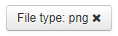
Pie
If you select the "pie" chart type, you get a graphic as shown below. The possible settings can be found here.
Example:
<div data-template="charts"
data-charttype="pie"
data-chartSourceName="extension"
data-chartTitle="Erweiterung"
data-showlegend="true"
></div>
Attributes
- data-colors: Defines a list of colors that can be used in a pie chart. Colors can be differentiated with a semi colon.
- Type: Array
- Example: data-colors="#FFCC00;#FFEE11"
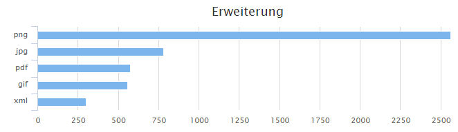
Bar
If you select the "bar" chart type, you get a graphic as shown below. The possible settings can be found here.
Example:
<div data-template="charts"
data-charttype="bar"
data-chartSourceName="extension"
data-chartTitle="Erweiterung"
></div>
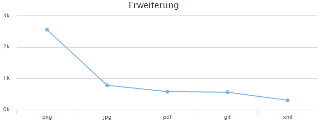
Line
If you select the chart type “line”, you will receive a graphic similar to the one below. The possible settings can be found here.
Example:
<div data-template="charts"
data-charttype="line"
data-chartSourceName="extension"
data-chartTitle="Erweiterung"
></div>
Polar
If you select the chart type “polar”, you will receive a graphic similar to the one below. The possible settings can be found here.
 Example:
<div data-template="charts"
data-charttype="polar"
data-chartSourceName="scrumdata_exel"
data-chartTitle="Scrum"
></div>
Bubble
If you select the chart type “bubble”, you will receive a graphic similar to the one below. The possible settings can be found here.
Example:
<div data-template="charts"
data-charttype="packedbubble"
data-chartSourceName="scrumdata_exel"
data-chartTitle="Scrum"
></div>
Chart settings
data-template: “Charts” is specified as the template.
data-charttype: Specifies the type of chart. In this case, “pie” is used.
data-chartsourcename: Specifies the filter to be used (e.g. “extension“, “mes:size“, etc.)
data-enablecustomsourcename: Specifies whether sourcename or custom sourcename should be used (“true” or “false” - Default: "false")
data-customsourcename: Specifies the custom sourcename to be used if it is not present in the Sourcename dropdown-list. (Text – Default: not set) . If the incorrect sourcename is set the warning will be displayed.
data-charttitle: Sets a heading or title. Example: “Extension”.
data-showlegend: Displays the values in the legend (“true” or “false” − default: “false”).
data-chartheight: Sets the height of the chart (default “200”).
data-chartwidth: Sets the width of the chart (default 100 percent).
data-chartcategories: Sets the categories of the chart (minimum is 3). Example: “Solution Design,Go-Live,Project Setup”.
data-chartresults: Sets the number of the chart (default is 5).
data-titlealign: Alignment of the heading (“left”, “center”, “right” - Default: “center”).
collect
Widget for results that were collected using the "Collect" action.
Screenshot:

Model: application.models.collected
Beispiele:
<div data-template="collect"></div>
Settings:
- data-favorites-collection-path: Persisted Collection path for saving the collected results. Has to start with favorites/. Default: empty
- data-results-shortcut: Describtion of the keyboard-shortcut used to navigate to the results Example: Alt+2, Default: empty
constraints
Displays a filter for the constraints of the data sources. In Microsoft Exchange, for example, the user can choose from E-mail, Attachment, Calendar, Contact, Task, Note and Mail.
Screenshot:
Model: application.models.userSourceInfo
Example:
<div data-template="constraints" data-model="userSourceInfo" data-path="sources.constraints"></div>
Mustache templates
See Mustache templates under filteredfacet.
Client Notifications (clientnotification)
You have the possibility to inform your users about the latest features and tools via the “clientnotification” component. Please be aware that the clientnotification widget can only be activated by an administrator.
This component is integrated into the client application by default. To set up the notification, create a JSON file suitable for your application context in the main menu item "File Manager". Open the File Manager and then the "Local Filesystem". There, click on the folder "data" and then on the folder "resources". Then create a new folder with the name “client_notifications“ and create the JSON file "client_notification.json" in this folder.

Attention: The name of this file must be "client_notification.json", otherwise the function will not work, even if the content is correct.
Default Template
The default template is available for the standard client and is activated by default. Insert the default template into the created file client_notification.json to customise your client notifications:
{
"theme": {
"rightPosition": "1.25rem",
"topPosition": "4.75rem",
"leftPosition": "",
"bottomPosition": "",
"backgroundColor": "",
"previewTextColor": "",
"previewTextFontSize": "",
"leftBorderColor": "",
"okButtonColor": "",
"okButtonTextColor": "",
"deactivateButtonColor": "",
"deactivateButtonTextColor": "",
"notNowButtonColor": "",
"notNowButtonTextColor": "",
"titleFontSize": "",
"maxWidth": ""
},
"generalConfig": {
"notificationSnoozeTimeInHours": 24,
"enableAllNotifications": false
},
"items": [
{
"id": "1",
"version": 1,
"clientNotificationType": "outlook-add-in",
"targetApplications": [
"Chrome",
"Firefox",
"Edge"
],
"clientNotificationContent": {
"title": {
"en": "Microsoft Outlook Add-In available",
"de": "Microsoft Outlook Add-In verfügbar"
},
"previewTextDescription": {
"en": "With the Outlook Add-in, search and your Insight apps are seamlessly integrated into Microsoft Outlook.",
"de": "Mit dem Outlook-Add-in werden die Suche und Ihre Insight Apps nahtlos in Microsoft Outlook integriert."
}
},
"clientNotificationActions": [
{
"action": "download",
"label" : {
"en": "Download Installer",
"de": "Installer herunterladen"
},
"href": "/api/download/Mindbreeze%20Outlook%20Add-In/vsto/setup.exe",
"precheckUrl": "/api/download/Mindbreeze%20Outlook%20Add-In/vsto/Mindbreeze.OutlookAddin.vsto"
}
],
"requiresResourcePlugin" : "Mindbreeze Outlook Add-In",
"isEnabled": true
},
{
"id": "2",
"version": 1,
"clientNotificationType": "edge-plugin",
"targetApplications": [
"Edge"
],
"clientNotificationContent": {
"title": {
"en": "Microsoft Edge Add-on available",
"de": "Microsoft Edge Add-on verfügbar"
},
"previewTextDescription": {
"en": "The Microsoft Edge Add-on integrates the search functionality into the Microsoft Edge browser.",
"de": "Mit dem Microsoft Edge Add-on wird die Suchfunktionalität in den Microsoft Edge Browser integriert."
}
},
"clientNotificationActions": [
{
"action": "download",
"label" : {
"en": "Open Microsoft Edge Add-on",
"de": "Microsoft Edge Add-on öffnen"
},
"href": "https://microsoftedge.microsoft.com/addons/detail/mindbreeze-inspire/olnededlkneidefhclnhcambjlhpcmfa"
}
],
"isEnabled": true
},
{
"id": "3",
"version": 1,
"clientNotificationType": "chrome-plugin",
"targetApplications": [
"Chrome"
],
"clientNotificationContent": {
"title": {
"en": "Google Chrome Extension available",
"de": "Google Chrome Erweiterung verfügbar"
},
"previewTextDescription": {
"en": "The Google Chrome extension integrates the search functionality into the Chrome browser.",
"de": "Mit der Google Chrome Erweiterung wird die Suchfunktionalität in den Chrome Browser integriert."
}
},
"clientNotificationActions": [
{
"action": "download",
"label" : {
"en": "Open Extension in Webstore",
"de": "Erweiterung im Webstore öffnen"
},
"href": "https://chromewebstore.google.com/detail/mindbreeze-inspire/ejlaikiclffdgdnpjhgikiefnnaajgdi?pli=1"
}
],
"isEnabled": true
}
]
}
You also have the possibility to customize some basic themes based on your needs. For advanced changes, please use the CSS file. All HTML tags are accessible via the prefix “.clientnotification” in the CSS file.
Properties
theme
Here you can pass simple CSS values to change the font position and the color of the notification. Please be aware that you can only use existing keys. For example, the existing key “leftPosition” will work, while a slight variation of the key like “myleftPosition” will not work.
The following properties can be adjusted to your needs:
Value type | Description | |
rightPosition | px , em rem | Distance of the notification from the right side. |
topPosition | px , em rem | Distance of the notification from the top. |
leftPosition | px , em rem | Distance of the notification from the left side. |
bottomPosition | px , em rem | Distance of the notification from the bottom. |
backgroundColor | HEX | The background color of the notification. |
previewTextColor | HEX | The text color of the preview text. |
previewTextFontSize | px | The font size of the preview text. |
leftBorderColor | HEX | The color of the left border. |
okButtonColor | HEX | The background color of the “OK” button. |
okButtonTextColor | HEX | The text color of the “OK” button. |
deactivateButtonColor | HEX | To deactivate the background color of the “OK” button. |
deactivateButtonTextColor | HEX | To deactivate the text color of the “OK” button. |
notNowButtonColor | HEX | The background color of the “Remind me later” button. |
notNowButtonTextColor | HEX | The text color of the “Remind me later” button. |
titleFontSize | px | The font size of the title of the notification. |

generalConfig
The property “generalConfig” defines configurations that apply to every notification. The following properties can be adjusted to your needs:
Value type | Description | |
notificationSnoozeTimeInHours | number | Defines how long the notification will be inactivate when the user clicks the button “Not now, later”. If the value is zero or empty, the notification will be shown again in 24 hours which is the default value. |
boolean | If the value for this property is set to “false” or the property is removed from the generalConfig object, all client notifications are turned off. |
Important: You can still access disabled notifications via URL parameters without making them globally and/or individually enabled. For more information, you can also see .
Items
The property “Items” defines a list of all client notifications to be shown. The following properties can be adjusted to your needs:
Value type | Description | |
id | string | Defines the ID of the notification. |
version | number | Defines the version of the notification. If you have the same notification with different versions, the latest version will be shown to the user. This means that you can have the same ID with different versions. |
clientNotificationType | string | Defines the type of notification, for example “outlook add in”. |
targetApplications | Array<string> | Defines the browser platforms on which you want to show the notification. |
clientNotificationContent | Object | Here you can define the title and the text of the notification. You can add different languages with the according language keys. For example “fr” for French. |
previewTextDescription | string | Here you can define the preview text of the notification. You can also define the preview text in several languages. |
clientNotificationActions | Array <ClientNotificationActionObject> | Defines the action that can be performed by the user. Currently, only a download can be defined as an action. Here you can provide an absolute path as well as a relative path to the resource you want the user to see. |
isEnabled | boolean | Enables or disables the notification. |
Client notification action object
Property | Value type | Description |
action | enum | Possible values: download. Attention: The value “download” has to be lowercase. |
label | Array <Object> | A list of objects with the language and its values. For example: [ {key: "en", value: "Download Installer"} ] |
href | string | Destination link for the action. |
precheckUrl | string | A link to precheck if a resource is available, in order to show the notification. If this precheck request fails, the notification will not be shown. |
Disable clientnotification
There are four options to choose from:
- Set the setting disabledClientNotifications in the Application Options to "true". This completely prevents client notifications from being requested.
- Set the setting enableAllNotifications in the JSON configuration to "false" or remove the property from generalConfig. This completely prevents client notifications from being shown.
- Create an empty JSON file under /data/resources/client_notifications/client_notification.json (Linux) or in C:\Program Files\Mindbreeze\Enterprise Search\Server\resources\client_notifications\client_notification.json (Windows) containing the value "{ }".
- If you have a JSON notification item containing values, the flag "isEnabled" is available for each notification. Set this flag to "false".
Debug and check disabled notifications
If the client notification is activated in the global configuration, you can check your client notifications before setting the property "isEnabled" to “true”. Each notification has an own “isEnabled” property that can be activated or deactivated individually.
If you want to check a notification that is disabled (in other words not published for all users or "isEnabled: false"), you can access that notification via the query parameter. For example:
apps/client/?previewClientNotificationId=2.
datasources
Displays a filter for the data sources. Here data sources such as Microsoft Exchange, Fabasoft Folio and Microsoft SharePoint can be selected.
Screenshot:

Model: application.models.userSourceInfo
Example:
<div data-template="datasources" data-model="userSourceInfo" data-path="sources.data_sources"></div>
Mustache templates
See Mustache templates under filteredfacet.
inputdate
Provides date selection for an input field. The template must be used on an input element. The name attribute specifies which metadata is restricted.

Examples:
<input name="mydate" data-template="inputdate" data-isrange="true" placeholder="Datum" >
<input name="mydate" data-template="inputdate">
Out of the box support for placeholder and icon via “Options” Object:
Developers can extend the options object passing to data-template=”inputdate”. This enables automatic integration for icon and placeholder.
Examples:
Options = _.extends(options , {
inputdatePlaceholder :"Date",
inputdateIcon : "icon-calendar",
})
Settings:
- name: Name of the metadata for the restriction
- data-isrange: If true, a time range can be specified. Default value: false
- data-format: Format of date. Default value: “DD.MM.YYYY”
Optional values:
"DD.MM.YYYY", "DD-MM-YYYY", "MM.DD.YYYY", "MM-DD-YYYY",
"D. MMMM YYYY", "DD. MMMM YYYY", "DD MMMM YYYY"
D - Single digits without Zero
DD – Number of Day
M – Single digits witout Zero
MM – Number of Month
MMMM – Name of the Month
MMM – Short name of Month
date filter

The date filter can also start on a monthly basis. The order is from the latest to the oldest date.
This setting can be found in Client Services under “Filter Settings”. The following setting is required:
- Flat Date Filter Values (Month Year): "true"

feedback
Feedback component displays result items persisted data and offers the possibility to change its value in Persisted Resources.
This component will display a dropdown list in results actions with entries coming from the backend service. For authenticated users this value is changeable, otherwise it will be read only.
Example:
<div
data-template="feedback"
data-enabled="$$DOCUMENT_LABELING_ENABLED$$"
data-label-path="$$DOCUMENT_LABELING_LABEL_PATH$$"
data-feedback-path="$$DOCUMENT_LABELING_FEEDBACK_PATH$$"
data-label-property="$$DOCUMENT_LABELING_LABEL_PROPERTY$$"
>
</div>
If you do not want to use language replacement variables in attributes, please use the following format for:
- data-label-path=” labeldefinition/<your-label-path>”
- data-collection-path=”itemdata/<your-feedback-collection>”
Template attributes:
Attribute | Description | Value |
data-label-path | Available Labels Collection | $$DOCUMENT_LABELING_LABEL_PATH$$ |
data-feedback-path | Labeling Feedback Collection | $$DOCUMENT_LABELING_FEEDBACK_PATH$$ |
data-label-property | The property which is displayed as the default value for a result (example: learningcontent, no-learningcontent). | $$DOCUMENT_LABELING_LABEL_PROPERTY$$ |
data-enabled | Whether component should be enabled | Data type: Boolean, Default: false "$$DOCUMENT_LABELING_ENABLED$$" |
In order to include the Feedback component, the following settings must be enabled and configured properly in the Client Service:
- Text Classification, Document Labeling and Persisted Resource configuration: Find more about such configurations in "Text Classification Insight Services".
feedbackbutton
Displays the app.telemetry feedback button. The feedback button is visible only when app.telemetry is enabled for the client and the URL is configured in the client service.
Screenshot:
Example:
<span data-template="feedbackbutton" data-check-if-enabled-in-profile="true"></span>
Settings:
- data-check-if-enabled-in-profile: the feedback button can be enabled or disabled in the profile. This option allows you to specify whether the profile setting is taken into account. Values: true, false.
- data-formid: defines which feedback form is used. The necessary Form ID can be found in app.telemetry. If no Form ID is specified, the default form is used.
The URL has to be entered in the “Fabasoft app.telemetry Web API URL” input box in the client service.
filteredfacet
Screenshot:

Model: application.models.search + FacetValueCollection + FacetValueCollection.Entry
Examples:
<div data-template="filteredfacet" data-name="mes:date" data-user-input="disabled"></div>
<div data-template="filteredfacet">
<script type="text/x-mustache-template"
data-tag-name="span"
data-attr-title="{{name}}{{^name?}}{{html}}{{/name?}}"
>
{{{html}}}
<span class="pull-right">{{^count?}}-{{/count?}}{{count}}</span>
{{^excluded}}
{{#count?}}
<span class="pull-right">{{count}}</span>
{{/count?}}
{{/excluded}}
{{#excluded}}
<span class="pull-right">–</span>
{{/excluded}}
</script>
</div>
<div data-template="filteredfacet"
data-name="Author"
data-container-tag-name="div"
data-container-class-name="filter"
data-entry-tag-name="div"
data-entry-class-name="entry">
</div>
Output:
<div data-template="filteredfacet"
data-name="Author"
data-title-tag-name="h3"
data-title-class-name="title"
data-container-tag-name="div"
data-container-class-name="filter"
data-entry-tag-name="div"
data-entry-class-name="entry">
<h3 class="title">Autor</h3>
<div class="filter">
<div class="entry">
...
</div>
...
</div>
</div>
Settings:
- data-name: The metadata used for the filter
- data-user-input: When disabled, the user input under the filter can be deactivated. With “auto,” the user input is adapted to the type of filter, e.g. date input for date values, auto-completion for text values. If not otherwise specified, “auto” is used.
This setting replaces data-suggest:
data-suggest="false" => data-user-input="disabled"
data-suggest="true" => data-user-input="auto" - data-user-input-template: The widget that is used for user input. With “suggest” the autocompletion is displayed; “inputdate” shows the date input. To use this value, data-user-input should not be set.
- data-user-input-<setting>: transfers settings to the user input widget. For example: data-user-input-isrange="true" in the input-date widget.
- data-always-visible: if “true” is set, the filter will be displayed even if no search has been set yet. Since the type of filter is not recognized without a search, data-user-input-template must be defined. Default value: false
- data-incomplete-class: This class is assigned to the HTML elemetn if the filter returrns „incomplete“. Default „mb-incomplete“.
- data-title: If you do not want to display the standard translation of the metadata name, enter the desired title here
- data-title-tag-name: The HTML tag used for the filter headings. Default value: h3
- data-title-class-name: The CSS class name used for the filter headings. Default value: empty
- data-title-template: Mustache template for displaying the title. Available values: title, isOpen. Default value: empty
- data-container-tag-name: The HTML tag for the element containing the filter entries. Default value: ul
- data-container-class-name: The CSS class name for the element containing the filter entries. Default value: empty
- data-entry-tag-name: The HTML tag for a filter entry. Default value: li
- data-entry-class-name: The CSS class name for a filter entry. Default value: empty
- data-entry-role: The ARIA role attribute for a filter entry. Default value: empty
- data-collapsible: “true” allows you to open and close the filter. Default value: false
- data-default-open: specifies whether the filter is open or closed by default. Default value: false
- data-displayed: Number of filter values displayed. Further restricts the display of the number configured on the client service. If there are more entries, they can be displayed using a button.
- data-dropdownfilter: Shows the entire filter in a dropdown list.
- data-close-on-focus-out: Specifies wether the dropdown list is closed automatically, when you click outside the dropdown list. By putting this setting to “true”, the dropdown list stays open, when clicking outside of the list. Default value: false
- data-and-available: Activates a “+” button next to a filter value with which an AND operation can be performed. Default value: false
- data-intersect-values: Used for linking the selected values AND, so that hits should contain all selected values. Default value: false
- data-order-criteria: COUNT sorts by frequency of occurrence, VALUE by filter value, PREDEFINED sorts by title in ascending order, and the first values can be specified in data-predefined-order.
- data-order-direction: ASCENDING and DESCENDING directly define the direction. Default value: ASCENDING
- data-predefined-order: List of values to be displayed at the beginning, separated by a comma or JSON. For example: pdf, gif or ["pdf", "gif"]
- data-restore-focus: Sets the focus back to the checkbox after selecting a value. Default value: true
- data-show-checkbox: Should a checkbox be displayed? Default value: true
- data-show-all: Should the option “All” be displayed? Default value: true
- data-all-descendants: Should the complete hierarchy be returned without restriction? Default value: false
- data-hide-filter-options: Hides the filter options and keeps the search box visible only. Default value: false
- data-inputdate-placeholder: Can provide a default translation for English and German via "i18n.daterangepicker_placeholder" or it can be replaced with any other valid string. In case data-user-input-template="inputdate" is set, then it will automatically show the provided placeholder.
- data-inputdate-icon: Accepts fontawesom icons as an input. As default value "icon-calendar" is suggested. In case data-user-input-template="inputdate" is set then it will automatically show the provided icon.
- data-all-title: Specifies the text that is displayed when no filters are selected. If no text is specified, a text predefined by Mindbreeze InSpire will be displayed.
Mustache templates
The template contains the value of a filter entry, the number of documents, and whether or not the entry is currently being included in the search.
Standard template:
{{{html}}}
<span class="pull-right">{{^count?}}-{{/count?}}{{count}}</span>
{{^excluded}}
{{#count?}}
<span class="pull-right">{{count}}</span>
{{/count?}}
{{/excluded}}
{{#excluded}}
<span class="pull-right">–</span>
{{/excluded}}
Values:
- html: The formatted value of the filter entry, e. g. pdf, John Doe, 2014
- value: The value of the filter entry (for example, for date values)
- count: the number of documents found for this entry
- excluded: the entry is not selected although others are selected
filteredfacets
Displays a set of filters. Currently, the group "mes:configuredfacets" is available, which contains all the filters selected in the client service configuration.
For the presentation of the individual filter, the filteredfacet widget is used. A presentation template for this can be deposited in filteredfacets. You can find the options for this template under mustache templates at filteredfacet. In addition, the filters can be displayed per option as combo boxes.
Screenshot:

Model: application.models.search + application.models.search.facets + FacetValueCollection + FacetValueCollection.Entry
Examples:
<div data-template="filteredfacets" data-name="mes:configuredfacets"></div>
<div data-template="filteredfacets" data-name="mes:configuredfacets">
<div style="display: none">
<div data-template="filteredfacet">
<script type="text/x-mustache-template"
data-tag-name="span"
data-attr-title="{{name}}{{^name?}}{{html}}{{/name?}}"
>
{{{html}}}
<span class="pull-right">{{^count?}}-{{/count?}}{{count}}</span>
{{^excluded}}
{{#count?}}
<span class="pull-right">{{count}}</span>
{{/count?}}
{{/excluded}}
{{#excluded}}
<span class="pull-right">–</span>
{{/excluded}}
</script>
</div>
</div>
</div>
Settings:
- data-name: the filter group which is displayed
- data-user-input: with disabled, user input can be disabled under the filter. With auto, the user input will be adapted to the type of filter, for example, date for date values, autocomplete for text values. Without specifying otherwise, auto is used.
- This setting replaces data-suggest:
data-suggest="false" => data-user-input="disabled"
data-suggest="true" => data-user-input="auto" - data-user-input-template: Widget that is used for the user input. With suggest, autocompletion is displayed, input date displays the date entry. data-user-input should not be entered, so that the value is used.
- data-user-input-<Einstellung>: transfers settings to the user input widget. For example data-user-input-isrange="true" with the input-date widget
- data-title-tag-name: HTML tag, which is used for the titles of the filter. Default: h5
- data-title-class-name: CSS class name that is used for the titles of the filter. Default: empty
- data-facet-container-tag-name: HTML tag for the element that contains the filter entries. Default: ul
- data-facet-container-class-name: CSS class name for the element that contains the filter entries. Default: empty
- data-facet-entry-tag-name: HTML tag for a filter entry. Default: li
- data-facet-entry-class-name: CSS class name for a filter entry. Default: empty
- data-collapsible: If true, the filter can be opened and closed. Default: false
- data-default-open: specifies whether the filter is opened or closed by default. Default: false
- data-displayed: Number of displayed filter values. Further restricts the display of the number configured on client service. If more entries are available, they can be displayed with a button.
- data-dropdownfilter: Shows all filters in a dropdown list. If set to “true”, the filters are displayed as a dropdown or combobox. Default: false.
- data-close-on-focus-out: Specifies wether the dropdown list is closed automatically, when you click outside the dropdown list. By putting this setting to “true”, the dropdown list stays open, when clicking outside of the list. Default value: false
- data-inputdate-placeholder: Can provide a default translation for English and German via "i18n.daterangepicker_placeholder" or be replaced with any other valid string. In case filteredfacets contains a filteredfacet using data-template="inputdate" the provided placeholder will automatically propagate to filteredfacet.
- data-inputdate-icon: Accepts fontawesom icons as an input. As default value "icon-calendar" is suggested. In case filteredfacets contains a filteredfacet using data-template="inputdate" the provided icon will automatically propagate to filteredfacet.
Mustache templates
The template for the filteredfacet widget is defined as follows:
<div data-template="filteredfacets" data-name="mes:configuredfacets">
<div style="display: none">
<div data-template="filteredfacet">
...
</div>
</div>
</div>
See Mustache templates under filteredfacet.
map
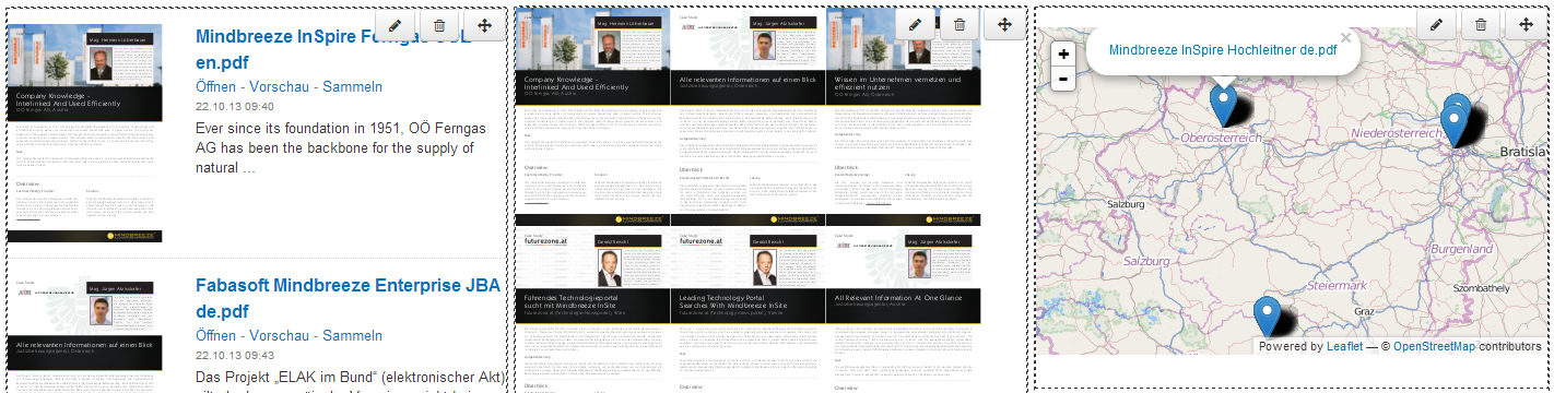
Shows results that contain geodata on a map. If there is no result with geodata, the map is not displayed. Geodata must be contained in the metadata geo_latitude and geo_longitude (as float, integer or string, in which case the decimal separator must be a point).
Screenshot:
Model: application.models.search + ResultCollection + ResultCollection.Entry
Example:
<div data-template="map"></div>
Mustache templates
The content of the marker can be customized using a mustache template. The template for the map widget is defined as follows (see mustache for help):
Example:
<div data-template="map”>
<script type="text/x-mustache-template" data-tag-name="span">
<a target="_blank" href="{{actions[0].href}}">{{{title}}}</a>
</script>
</div>
Display several markers for one result
With the following example, multiple markers can be displayed in the map for a single result with multiple geo_latitude/geo_longitude values.
The following structure is necessary:
"geo_latitude": { data: [ {"value": 15.3343 ], {"value": 14.11111}, … ] }
"geo_longitude": { data: [ {"value": 48.1234 ], {"value": 57.1234}, … ] }
"customProperty ": { data: [ {"value”: “Title 1”], {"value": “Title 2 }, … ] }
<div data-template="map" data-allow-symbolic-path="true" >
<script type="text/x-mustache-template" data-tag-name="span">
<a target="_blank" href="{{actions[0].href}}">
{{{customProperty[geo_index]}}}
</a>
</script>
</div>
Settings:
data-allow-symbolic-path: To enable dynamic properties like ‘myProp[index]’. Default false.
mustache
Any JavaScript object with mustache templates can be displayed using the mustache widget.
Special behavior: {{#...?}}{{/...?}} {{..}} vs. {{{...}}}
Examples:
<script type="text/x-mustache-template">
<h3>{{{icon}}} {{{title}}}</h3>
<p>
{{{content}}}
</p>
</script>
<script type="text/x-mustache-template" data-tag-name="span" data-class-name="myclass">
<h3>{{{icon}}} {{{title}}}</h3>
<p>
{{{content}}}
</p>
</script>
<script type="text/x-mustache-template" data-attr-id="{{myId}}" data-attr-title="{{title}}">
<h3>{{{icon}}} {{{title}}}</h3>
<p>
{{{content}}}
</p>
</script>
Settings:
- data-tag-name: HTML tag for the template. Default value: div
- data-class-name: CSS class name for the template. Default: empty
- data-use-output-only: If enabled, the input part of the model is not used for display. Default: false
- data-attr-*: attributes can be calculated with mustache templates, e.g. data-attr-id="{{myId}}" → <... id="valueOfMyId">.
Values:
The values depend on the model used, i.e. the surrounding widget. For translations i18n is always available, e.g.
{{i18n.Close}}
Events:
- afterRender: modelType:
- Parameters: application, widget, model
- Event target: application.views
pagination
With the pagination widget, users can view additional search results. Use this widget if you didn’t activate the option “Display Results while Scrolling” with the results.
Screenshot:

Examples:
<div data-template="pagination"></div>
<div data-template="pagination">
<a href="#" style="display:none" class="mb-next action" data-action="this.nextPage({ append: true })">
Load more results
</a>
</div>
<div data-template="pagination">
<a href="#" style="display:none" class="mb-previous action" data-action="this.previousPage()">
Previous
</a>
<a href="#" style="display:none" class="mb-next action" data-action="this.nextPage()">
Next
</a>
</div>
The pagination widget displays elements with CSS class name mb-next, if it is possible to scroll forward. If it is possible to scroll back, the CSS class name mb-previous is used.
In order to initiate the actions, use class class="... action" data-action="<Aktion>". Using the action this.nextPage() you can scroll forward; this.previousPage() you can scroll backward. If the results are to be added to the end of the list, use this.nextPage({ append: true }).
Pages widget
To navigate the search results page by page. Use this widget if you have not enabled the Show results when scrolling option for the results and you don't just want to navigate forward and backward.
Screenshot:
Examples:
<div data-template="pages"></div>
<div data-template="pages" data-max-page-count="15"></div>
<div data-template="pages">
<script type="text/x-mustache-template" data-class-name="mypaging" data-tag-name="ul">
{{#pages?}}
{{#pages}}
<li class="{{#current_page?}}active{{/current_page?}}"><a href="#" data-action-name="setPage" data-page="{{page_number}}">{{page}}</a></li>
{{/pages}}
{{/pages?}}
</script>
</div>
Settings:
- data-max-page-count: Maximum number of pages displayed. If there are more pages, the standard template outputs “...” (see screenshot).
Mustache templates
The following properties are available in the template:
pages: a list of available pages. current_page true returns the currently selected page. Page can be used to access the page number.
onFirstPage: contains true when the first page is selected
onLastPage: contains true if the last page is selected
more_avail: : contains true if more than the requested pages are available
The standard template:
<script type="text/x-mustache-template" data-class-name="pagination">
{{#pages?}}
<ul>
{{#onFirstPage?}}
<li class="disabled"><span>«</span><li>
{{/onFirstPage?}}
{{^onFirstPage?}}
<li><a href="#" data-action-name="previousPage">«</a><li>
{{/onFirstPage?}}
{{#pages}}
<li class="{{#current_page?}}active{{/current_page?}}"><a href="#" data-action-name="setPage" data-page="{{page}}">{{page}}</a></li>
{{/pages}}
{{#more_avail?}}
<li class="disabled"><span>…</span></li>
{{/more_avail?}}
{{#onLastPage?}}
<li class="disabled"><span>»</span><li>
{{/onLastPage?}}
{{^onLastPage?}}
<li><a href="#" data-action-name="nextPage">»</a><li>
{{/onLastPage?}}
</ul>
{{/pages?}}
</script>
preview
Displays the document preview, if the preview action was executed.
Screenshot:
Model: preview
Examples:
<div data-template="preview" id="mb_preview" data-loading-message="Please wait while your file loads. Large documents may take up to 60 seconds to preview." data-loading-message-styles="font-size: 14px; background-color: green; color:white"></div>
<div data-template="preview" id="mb_preview">
<script type="text/x-mustache-template">
<h3>
{{#actions.data[0].value.href?}}
<a href="{{actions.data[0].value.href}}">
{{/actions.data[0].value.href?}}
{{{icon}}} {{{title}}}
{{#actions.data[0].value.href?}}
</a>
{{/actions.data[0].value.href?}}
</h3>
{{#Author?}}Author: {{{Author}}}{{/Author?}}
{{#content?}}
<p>
{{{content}}}
</p>
{{/content?}}
</script>
</div>
- data-loading-message: Can be used to display a configurable message during the loading of a large document into the preview window.
- data-loading-message-styles: Can be used to adjust the stylings of the configurable loading message (e.g. font-size, font-color, background, etc.).
- data-content-highlight-regions: Can set a specific region to be highlighted in a PDF file in the PDF preview. This can be configured in the property “initAction” in the application options. There, the highlighting can be configured in the property “settings”. See the following example:
var application = new Application({
startSearch: false,
enableProfile: true,
updateTitle: true,
initAction:{
settings: {
"preview.contentHighlightRegions" : '{"regions":[{"start":4350,"end":4680}]}'
}
}
});
To mark the start and/or end point of a source or to highlight the source text, highlighting strategies need to be configured. For more information about highlighting strategy settings, please see the chapter The application object.
Mustache templates
You can find the options for this template under Mustache templates at results.
Standalone Preview
To activate the Preview component as standalone, set the attribute “data-standalone” to “true”. If you use the Insight App Designer you can now integrate preview component as standalone per-default.
This is very useful especially when you want to create an Insight App where you can chat with documents.
The standalone preview will take the first result from the results and project the content depending on the context (HTML page or PDF document).
Important: To use the preview in standalone mode you don’t need to wrap it in data-template="stack".
Note: To apply the initialized height adaptation and resize window height adaptation, use data-height=”auto”. This way the height of the PDF preview will adapt relative to the setting viewportElement. For more information about viewportElement, see viewportElement.
queryinfo
Displays Search Expressions

Example:
<div
data-template="queryinfo"
data-input-path="user.constraints.parsed.and.constraints"
data-title="Query Constraints"
class="constraints-container searchinfo_constraints">
</div>
The list of different options for the dropdown is provided by the function 'getQueryinfoSelectOptionProperties'. This function returns an object with "key", "label" and "type".
Key: The property - for example "extension"
Label: The readable value in the dropdown - For example "Extension"
Type: suggest | inputdate - Free text or date field
var customApp = Application.extend({
getQueryinfoSelectOptionProperties: function () {
return {
"extension": { label: "File Format", type: "suggest"}
}
}
});
The input-path is crucial from where the expressions are used for displaying it.
In the following example, it must be ensured that the search constraints at the searchinput are available under "user.constraints.parsed.and.constraints" and this thus look like the following:
search_request.user:
{
"query": {
"and": [{
"unparsed": "Searchterm",
"description": "Searchterm",
"id": "query"
}]
},
"constraints": [{
"and": [{
"or": [{
"label": "extension",
"unparsed": "PDF",
"id": "constraintsGroupFound[0].constraints[0]"
},{
"label": "extension",
"unparsed": "TXT",
"id": "constraintsGroupFound[0].constraints[1]"
}],
"id": "constraints"
}],
"id": "parsed"
}]
}
reset filters
Resets all selected filters, if the reset action was executed.
Screenshot:

Model: resetfilters
Example:
<div data-template="resetfilters"></div>
results
Displays results.
Screenshot:
Model: application.models.search + ResultCollection + ResultCollection.Entry
Example:
<div data-template="results" data-appendonscroll="true">
</div>
Settings:
- data-appendonscroll: Additional results will automatically be loaded when the user scrolls down. Enable this setting only if the results display is the last element on the page, otherwise the users cannot get to the elements under the results.
- data-enable-optional-terms: An element is automatically added to the results, which allows to set a specific search via "Missing: {Term}" - "Must contain: {Term}". (Values: true/false. Default true).
- data-optional-terms-ratio: If optional terms are enabled, the ratio of the terms can also be specified. Values: 0 – 1 (Default 0.33). Type Float
- data-enable-answers: Used to hide/show answers that are displayed above the results. This can be useful if you want to use the 'Answer' component in a different location. Answers component is also available as a standalone component, please read the answers component documentation for more information. (Values: true/false. Default: false).
Events:
this.options.application.views.trigger("afterRender:Result", this.options.application, view, model);
Mustache templates
All metadata, the preview image (thumbnail) and all actions of the document are available in the template. The following template shows the thumbnail and the title as a headline, underneath which you see the content of the document:
<h3>{{{icon}}} {{{title}}}</h3>
<p>
{{{content}}}
</p>
Enter the name of the metadata item in curly braces {{{ }}} in order to view it. For instance:
{{{Author}}}
or
Author: {{{Author}}}
If the metadata is not available, should the label "Author:" not be shown either? You can make the output optional using a condition:{{#Author?}}Author: {{{Author}}}{{/Author?}}
The complete template:
<h3>{{{icon}}} {{{title}}}</h3>
{{#Author?}}Autor: {{{Author}}}{{/Author?}}
{{#content?}}
<p>
{{{content}}}
</p>
{{/content?}}
The output might look like this:
<div>
<h3><img src="..."> Document</h3>
Autor: John Doe
<p>
Lorem impsum ...
</p>
</div>
<div>
<h3><img src="..."> John Doe</h3>
</div>
With {{#actions.data}}{{{html}}}{{/actions.data}} you output all actions. In order to access the first action only, you can use {{actions.data[0].value.href}}.
The complete template with the first action as link:
<h3>
{{#actions.data[0].value.href?}}
<a href="{{actions.data[0].value.href}}">
{{/actions.data[0].value.href?}}
{{{icon}}} {{{title}}}
{{#actions.data[0].value.href?}}
</a>
{{/actions.data[0].value.href?}}
</h3>
{{#Author?}}Author: {{{Author}}}{{/Author?}}
{{#content?}}
<p>
{{{content}}}
</p>
{{/content?}}
The output could look as follows:
<div>
<h3><a href="http://..."><img src="..."> Dokument</a></h3>
Autor: John Doe
<p>
Lorem impsum ...
</p>
</div>
<div>
<h3><a href="http://..."><img src="..."> John Doe</a></h3>
</div>
resultsprogress
The resultsprogress widget uses a progress bar to show how many of the available results have already been loaded.
Example:
<div data-template="resultsprogress"></div>
savedsearches
This widget displays your saved searches. When the mouse pointer hovers over the text, a "copy" icon also appears. Clicking this icon will create a link containing all the settings filters etc. of that search and you can paste it directly into the address bar and thus also submit your saved search. This also gives you the opportunity to share your search with other people

Model: application.models.savedSearches
Examples:
<div data-template="savedsearches" aria-controls="main"></div>
<div data-template="savedsearches" aria-controls="main" data-title-class-name="subhead" data-title-tag-name="h3">
Settings:
- aria-controls: if the attribute contains the ID of another element, this element is focalized after a search has been discontinued. Default: empty
- data-title-tag-name: HTML tag which is used for the header. Default: h2
- data-title-class-name: CSS class name which is used for the header. Default: empty
- data-serversaved: Saves the search at the server. Default: false
- data-query-string-limit: Sets the length of the generated URL. To enable the setting, the value must be greater than 0.
Example:
<div data-template="savedsearches" data-query-string-limit="2084" ></div>
search
The search-widget is used for displaying multiple searches in one application for example your default results and above this results some persons or pictures.
Use the template-refid to reference a placeholder with your search-results (example below). For all placeholders the number of display results can be customized (data-count).
Example:
Use this example if you would like to show three results of “txt”-files and five results of “persons”.
<div data-template="search" data-count="3" data-name="show-txt" data-constraint="extension:txt" data-template-refid="show-all-txt-files"></div>
<div data-template="search" data-count="5" data-name="persons" data-constraint="categoryclass:person" data-template-refid="show-persons"></div>
<div data-mb-exclude="true">
<div id="show-all-txt-files">
<div data-template="results">
<script type="text/x-mustache-template">
<div class="title">
{{{title}}}
</div>
</script>
</div>
</div>
</div>
<div data-mb-exclude="true">
<div id="show-persons">
<div data-template="results">
<script type="text/x-mustache-template">
<div class="title">
{{{title}}}
</div>
{{{person.name}}}
</script>
</div>
</div>
</div>
Example 2:
In addition to the option data-template-refid you can directly use the components as a child of the ‘Search’ widget:
<div data-template="search" data-name="show-txt" data-constraint="extension:txt" data-template-refid="show-all-txt-files">
<div data-template="results"></div>
</div>
In this example we just render results with the extension ‘txt’ within the search container
Settings:
- data-template-refid: The reference to the container with the option data-template=“results“. This container must have a <div data-mb-exclude="true"> around.
- data-count: The number of displayed results for every search-container. Note that the number of results is limited by the advanced setting “Maximum Request Result Count” under the “Client Service” tab in the “Configuration” menu. This means that the setting data-count cannot excceed the configured limit in the setting “Maximum Request Result Count”.
- data-constraint: Restriction for the search.
- data-enabled-views: Specifies on which tabs a search container should be displayed or enabled. The list consists of the names of the tabs on which the search container is to be activated. The names must be separated by a comma.
- For example: "tab1,tab2".
- data-disabled-views: Specifies on which tabs a search container should not be displayed or disabled. The list consists of the names of the tabs on which the search container is to be deactivated. The names must be separated by a comma.
- For example: "tab1,tab2".
- data-name: Used to identify specific searched. Is also available as “Request Name” in app.telemetry.
- data-channel-url: The URL of the target server to be used for federating search results. Type: String.
- data-inherit-constraints-from-parent: To use restrictions from the main search in the search container as well.
- Example: A filter of the main search is also applied in the search container.
- Default value: true.
- data-channel-type: Used to identify the channel type used for communication. (e.g. CrossDomainAjaxChannel, EWSChannel, …etc.). If the data-channel-url attribute is provided and no data-channel-type is passed the default channel is CrossDomainAjaxChannel (Type: “string“).
- parent-user-query-as-constraint: To use the search term of the main search as a further search restriction.
- initialize-from-parent-user-query: Initialization of the search with the main search.
- data-propagate-to-parent: If set to “true”, changes made to the search in a search container will be propagated to elements outside of the search container like the Mindbreeze Client.
- Possible values: “true” and “false”
- Default value: false
searchform
The searchform widget is used to enter search terms. It can contain multiple input elements (input, select). Use the name-Attribut to search for the query term in one metadata item only. Without name-Attribut or if name="query", the input will be used as a general search term.
Screenshot:
Model: application.models.search.input
Examples:
<form data-template="searchform">
<input autofocus>
<input name="extension"> <!-- Search terms in this search field will only be looked up in the metadata extension -->
<button type="submit" tabindex="-1">Search</button>
</form>
<form class="center search-field mb-print-left" data-template="searchform" data-requires-user-input="true">
<input data-template="suggest"
data-disabled="$$DISABLE_MAIN_SUGGEST$$"
data-placeholder="search"
class="mb-query" name="query" type="search"
data-aria-label="search"
>
<button class="btn btn-link mb-no-print" type="submit" tabindex="-1"><i class="icon-search"></i></button>
</form>
Settings:
- data-requires-user-input: When this option is enabled, a search term must be entered in order to start a search (it is not enough to just select a tab or a filter). This setting can be applied to a search form and a search container. Default value: false
- aria-controls: If the attribute contains the ID of another element, this element is focalized after a search has been discontinued. Default: empty
- data-autofocus: If this setting is enabled, the search input is automatically focused on the search bar, when the page is loaded. This allows users to type the search request in the search bar immediately. Default value: false
The attribute data-query-template specifies the search that will be used for an input field. Use {{value}} as a placeholder for the value entered.
<input data-query-template="{ "label": "extension", "regex": "{{value}}" }" name="extension">
<!—The input value {{value}} will be replaced in the template, e.g. Input: doc.* Search: { "label": "extension", "regex": "doc.*" } -->
searchinfo
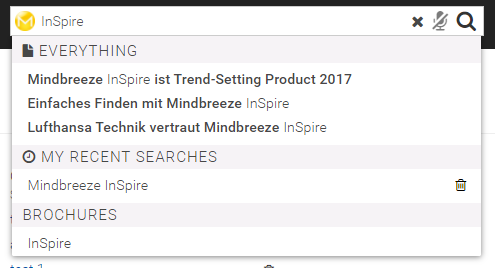
Displays information about the search results. The default template shows search timeouts, "No Results Found" and alternative search queries.
Model: application.models.search
Examples:
<div data-template="searchinfo"></div>
<div data-template="searchinfo">
<script type="text/x-mustache-template">
{{^computing?}}
{{#status_messages.timeout}}
<div class="alert">
<button type="button" class="close" data-dismiss="alert" title="{{i18n.Close}}">×</button>
{{error}}
{{warning}}
{{info}}
</div>
{{/status_messages.timeout}}
{{#status_messages.no_results?}}
<h5>
{{status_messages.no_results.error}}
{{status_messages.no_results.warning}}
{{status_messages.no_results.info}}
</h5>
{{#alternatives.query_spelling.entries[0]?}}
<p>
{{{i18n.client_did_you_mean}}}:
<a href="#" class="action" data-action-object="{"setDidYouMean": {"query": {{alternatives.query_spelling.entries[0].query_expr}} }}">
{{{alternatives.query_spelling.entries[0].html}}}
</a>
</p>
{{/alternatives.query_spelling.entries[0]?}}
{{/status_messages.no_results?}}
{{/computing?}}
</script>
</div>
Mustache templates
In the template, the entire search model is available.
Default template:
{{^computing?}}
{{#status_messages.timeout}}
<div class="alert">
<button type="button" class="close" data-dismiss="alert" title="{{i18n.Close}}">×</button>
{{error}}
{{warning}}
{{info}}
</div>
{{/status_messages.timeout}}
{{#status_messages.no_results?}}
<h5>
{{status_messages.no_results.error}}
{{status_messages.no_results.warning}}
{{status_messages.no_results.info}}
</h5>
{{#alternatives.query_spelling.entries[0]?}}
<p>
{{{i18n.client_did_you_mean}}}:
<a href="#" class="action" data-action-object="{"setDidYouMean": {"query": {{alternatives.query_spelling.entries[0].query_expr}} }}">
{{{alternatives.query_spelling.entries[0].html}}}
</a>
</p>
{{/alternatives.query_spelling.entries[0]?}}
{{/status_messages.no_results?}}
{{/computing?}}
- alternatives: Suggestions for the entered search term, currently query_spelling.entries[0] leads to the first suggested correction. Note: if contrary to expectations no alternatives appear and own logical operators are used in the query, see: Notes on Query Spelling Alternatives
- computing: true, if a search is being executed
- status_messages: Status messages about the search (e.g. status_messages.timeout or status_messages.no_results)
- estimated_count: Number of hits for the triggered search
- orderable: a list of available sort criteria includes localized_name for the display and name for the selection in the API. isSelected contains true, if the sort criterion is selected.
sortswitch
Displays the sort criteria available for the search
Screenshot:

Model: application.models.search
Examples:
<div data-template="sortswitch" class="pull-right">
</div>
<div data-template="sortswitch" class="pull-right">
{{#orderable?}}
<ul>
{{#orderable}}
<li class="{{#isSelected?}}selected{{/isSelected?}}">
<a class="action" tabindex="0" data-name="orderby" data-value="{{name}}">{{localized_name}}</a>
</li>
{{/orderable}}
</ul>
{{/orderable?}}
</div>
Mustache templates
In the template, the entire search model is available.
Default template:
{{#orderable?}}
{{{i18n.client_toolbar_sortingalgorithm_label}}}:
<ul class="mb-inline">
{{#orderable}}
<li class="mb-selectable {{#isSelected?}}mb-selected{{/isSelected?}}"><a class="action" tabindex="0" data-name="orderby" data-value="{{name}}">{{localized_name}}</a></li>
{{/orderable}}
</ul>
{{/orderable?}}
Values:
See Mustache templates searchinfo.
stack
Using the stack widget, users can perform actions that execute a new Insight App as a new search. Visually, the executed action is on top of the last executed action. This allows the user to easily jump back in the navigation path.
Screenshot:

+--------------+ +--------------+ +--------------+
| Results | | Results o------> | Results |
| | |+--------------+ | |
| | || Preview | | |
| | || | | |
| | || | | |
| Action o--------> || | | |
| ------ | || | | |
| | || | | |
| | || | | |
| | || | | |
+--------------+ +| | +--------------+
| |
+--------------+
Examples:
<div class="mb-stack" data-template="stack" data-model="stack">
<div class="mb-stack-title">
Results
</div>
<div class="mb-stack-content">
<a href="#"
data-action-object="{
"pushStack": {
"title": "PDF-Dokumente",
"template-ref": "pdfAppTemplate",
"applicationOptions": {
"startSearch": true
}}}">
PDF-Dokumente
</a>
<div data-template="view" data-count="5">
<div data-template="results"></div>
</div>
</div>
</div>
<div style="display: none" data-mb-exclude="true">
<div id="pdfAppTemplate">
<div data-template="view" data-count="5" data-constraint="extension:pdf">
<div data-template="results"></div>
</div>
</div>
</div>
Example: Display all Information About a Person
<div data-template="results">
...
<a href="#"
data-action-object="{
"pushStack": {
"title": "{{name}}",
"template-ref": "personTemplate",
"action": "showPerson"
}}">
All about {{{name}}}
</a>
...
</div>
...
<div style="display: none" data-mb-exclude="true">
<div id="personTemplate">
<div data-template="view" data-count="5">
<div data-template="results"></div>
</div>
</div>
</div>
...
<script>
var MyApplication = Application.extend({
showPerson: function (options) {
var personId = options.model.get("id");
this.models.search.set("constraint", {unparsed:'(categoryclass:person AND id:"' + personId + '") OR lastmodifiedby:"' + personId +'"'});
}
});
</script>
Parameters of the action pushStack:
- template-ref: The id of the HTML element that contains the template for the stack.
- title: The title of the stack element. Default: title of the link
- applicationOptions: The initialization options for the Insight App
- action: An action that is executed after initializing the new Insight App
suggest
Allows you to use the auto-completion in an input field. From now on, popular searches, recently performed searches, and terms from taxonomies alongside the search results from metadata can be also suggested. Additionally, it is possible to search all available tabs using the search term.
Screenshot: Suggests if the search string is empty (latest searches):
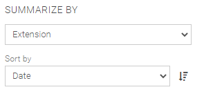 Screenshot: Suggests for the search term “Mindbreeze” from metadata and tabs:

Suggest Default Example (can be found in the respective HTML):
<input data-template="suggest"
data-disabled="$$DISABLE_MAIN_SUGGEST$$"
data-placeholder="search"
data-shortcut="alt+1"
id="query"
data-aria-describedby="search-description"
data-source-id-pattern="$$SUGGEST_SOURCE_ID_PATTERN$$"
data-initial-source-id-pattern="$$SUGGEST_INITIAL_SOURCE_ID_PATTERN$$"
data-grouped="true"
class="mb-query mb-role" name="query" type="search"
autofocus
>
Settings:
- property: the metadata to be used for completion. Default value: title
- property-constraint: a search term to restrict the possible values. Default value: empty
- count: the number of suggestions. Default value: 4
- source-id-pattern: Specifies the suggest sources (e.g.: document_property|recent_query|tabs)
Default value: $$SUGGEST_SOURCE_ID_PATTERN$$. If this setting is changed, the settings in the configurator (checkboxes for activating the suggestions) are not taken into account and overwritten.- document_property – provides suggestions from metadata
- popularsearches – provides suggestions from the database (settings required in the configuration)
- words_and_terms – provides suggestions from a concept index (CSV file) - (settings in the configuration required)
- recent_query – delivers suggestions from the most recent queries
- tabs – lists the available tabs to be able to search in all tabs
- initial-source-id-pattern: Settings are the same as source-id-pattern except that the hits from these sources are displayed when the search term is empty.
Default value: $$SUGGEST_INITIAL_SOURCE_ID_PATTERN$$. If this setting is changed, the settings in the configurator (check-boxes for activating the suggestions) are not taken into account and overwritten. - service: URL to a suggest service. Default value: empty − same as search
- disabled: Suggestions are disabled. Default value: false
- grouped: groups the autocomplete hits (true/false)
- initial-grouped: Grouping of the hits at the initial search (true/false). Default value: true
- show-onfocus: Displays the Autocomplete when focusing the text field (true/false). Default value: false*1
- suggest-timeout: Sets a timeout for the request. Specified in seconds.
- source-id-document_property-title: Sets the title of the “document_property” source.*1
- source-id-popularsearches-title: Sets the title of the “popularsearches” source.*1
- source-id-words-and-terms-title: Sets the title of the “word_and_term” source.*1
- source-id-recent-query-title: Sets the title of the “recent_query” source.*1
- default-tab-title: If no tab is available, this value is used as the title.*1
- source-id-order: Determines the order in Suggest:*1
Example: “document_property,words_and_terms,tabs,recent_query“ (separated by commas) - initial-source-id-order: Determines the order in Suggest, which is displayed when the search field is focused (setting identical to source-id-order).*1
- before-submit-action – triggers the function that is defined on the application and is called before submit action is called. Example: “application.transformQuery(view)” *1
*1 Upon request, these settings have to be adapted directly in the HTML file.

The snipped above can be extended by the settings. You can even remove some settings from the snipped. To Add a setting to the snipped, add a line to it, which looks like: data-SETTING=”VALUE”. In the example below we add the settings for the source, that just the content from the tabs is shown in the suggests and nor the default settings. If you do not add some the source-line yourself it will take the default-value.
Before:
input data-template="suggest"
data-placeholder="search"
class="mb-query"
name="query"
type="search"
data-aria-label="search"
autofocus
data-source-id-pattern="database"
data-grouped="true"
data-show-onfocus="true"
>
After:
input data-template="suggest"
data-placeholder="search"
class="mb-query"
name="query"
type="search"
data-grouped="true"
data-show-onfocus="true"
data-source=”TABS”
>
The settings for the suggested search terms can be entered in the configurator as follows:
Similar Terms
- Enable Suggesting of Similar Queries: If checked, the Suggest will be read via the related search terms from the database app.telemetry.
- ID: An ID can be assigned for each Suggest source (e.g. for styling)
- Source Name: The source name can be “Popular Searches“, for instance
- Database JDBC URL: URL for app.telemetry database
- Max Number of Database Connections: Maximum number of database connections. Default value: 10, minimum value: 2.
- Table Name: Table name from the App.Telementry configuration
- Table Column for Query: Selection of the number of results - App Telemetry Configuration
- Table Column for Score: Selection of the column names of the results from the App Telemetry configuration
- Table Column for View ID: Selection of the column name of the queries from the App Telemetry configuration
- Additional WHERE Clause: Here you have the possibility to create and add different "WHERE" clauses.
- Suggest If User Query Is Empty: if "true" is enabled, suggestions are given, even if the user has not yet searched.
Suggest Settings (Concept CSV):
- ID: The ID “words_and_terms” must be assigned (can be used for styling).
- Source Name: The source name can be e.g. “Words and terms”
- CSV File Path: The path to the CSV file
The CSV file must contain the columns Disabled, PrefLabel, AltLabel and Definition. The columns are used as follows:
Name | Function | Search term is checked | Must be set |
Disabled | TRUE: Line is ignored | No | No |
PrefLabel | Main part of the suggestion | Yes | Yes |
AltLabel | Displayed in parentheses after Preflabel | Yes | No |
Definition | Is displayed below the suggestion | No | No |
Example: The line
Disabled | PrefLabel | AltLabel | Definition |
Example | Sample | A definition |
is displayed in the autocompletion like this:

Suggest Settings and Initial Suggest Settings:
In principle: The settings under “Suggest Settings” are used as soon as a search term has been entered. “Initial Suggest Settings” are used if the search term is empty (see screenshot – suggestions with an empty search string of the last search).
- Enable Suggesting from CSV File: If this option is checked, the suggestion is read from a CSV file using similar search terms.
- Enable Suggesting of Similar Queries: If this option is checked, the suggestion is read from the App.Telemetry database using similar search terms.
- Enable Suggesting of Tabs: If this option is checked, the suggestion is read from the App.Telemetry database using similar search terms.
- Enable Suggesting of Document Property: If this option is checked, the suggestion is read from the App.Telemetry database using similar search terms.
- Enable Suggesting of Recent Queries: If this option is checked, the suggestion is read from the App.Telemetry database using similar search terms.
Tip: Simple instructions for creating the database for "Similar Terms":
- create database similarterms;
- CREATE USER mindbreeze WITH PASSWORD 'Mindbreeze123';
- grant all privileges on database " similarterms" to mindbreeze;
suggestlist
Allows the usage of suggest-sources (pouplar searches, words and terms) as separate component.
Settings:
- count: number of suggestions: default value 4
- title: default: Popular Searches
- property: metadata to be used for autocomplete. Default value: title
- source-id-pattern: suggest source
Screenshot:
Examples:
<div data-template="suggestlist" data-count="4" data-source-id-pattern="words_and_terms"></div>
summarize
Allows you to group similar results.
Configuration:
This feature can be enabled or disabled in the client service:
If this feature is active, the client gets a new section "Summarize by".

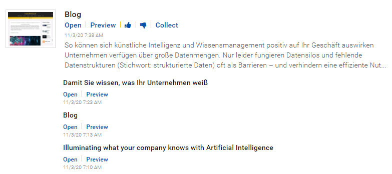
<div data-template="summarize" data-enabled="true"></div>
Settings:
- data-enabled: Enables or disables the feature (Default true).
- data-summarize_by.property: Results can be summarize by property.
Examples: “mes:relevance”, “mes:date”, “extension”, … (Default is empty) - data-summarize_by.orderby: Summarized results can be ordered by property.
Examples: “mes:relevance”, “mes:date”, “extension”, … (Default is empty) - data-summarize_by.order_direction: Summarized results can be ordered in ascending or descending order (Default is “ASCENDING”).
- data-summarize_by.aggregated_properties: Results can be summarize by aggregated properties with a name and it’s expression.
Note: This does not change the results, but only a new property is provided, which can be inserted at any place in the HTML via mustache templates (e.g.: next to the title).
Examples: [
{"name":"countProperty","expr":"count()"},
{"name":"sumProperty","expr":"sum()"},
{"name":"averageProperty","expr":"avg()"}
]
Descriptions and further examples of the aggregated properties can be found here. - data-summarize_by.summarize_non_existent: Results without the specified property are also summarized.
Example: When summarizing by the "extension" property, all other contents that do not have an "extension" (for example folders) are summarized into a common group. (Default is false)
To enable this feature in your custom Insight App, you have to modify the mustache snippet as described here.
This widget is also available in Designer under “More” tab.
tabs
Tabs that offer search constraints to choose from. The tabs are stored in the user profile, come from the sources and can also be determined in the element.
Screenshot:

Model: application.models.tabs, application.models.userSourceInfo
Examples:
<ul data-template="tabs" data-model="tabs" data-datasourcetabs="true">
</ul>
<ul class="nav" data-template="tabs" data-model="tabs" data-datasourcetabs="true">
<script type="text/x-mustache-template" data-tabconfig="true" data-name="PDF-Dokumente" data-constraint="extension:pdf"></script>
<script type="text/x-mustache-template" data-tabconfig="true" data-name="Everything"></script>
<script type="text/x-mustache-template"
data-tag-name="a"
data-attr-tabindex="{{#selected?}}-1{{/selected?}}{{^selected?}}0{{/selected?}}"
data-attr-class="action {{#selected?}}mb-selected{{/selected?}}"
data-attr-data-action-object="{"changeView":{"constraints.view": {{^constraint?}}null{{/constraint?}}{{{constraint}}} } }"
aria-hidden="true">
{{{name}}}
</script>
</ul>
Settings:
- data-model: tabs
- data-editable: if true, tabs can be added and edited by the user
- data-datasourcetabs: if true, tabs are displayed for the activated sources
- data-role: ARIA role of the tabs. Default value: tablist
- data-entry-role: ARIA role of the list entries. Default value: presentation
Create your own Tabs
You can create your own tabs in the template. To do this, use the following HTML:
<script type="text/x-mustache-template" data-tabconfig="true" data-name="PDF-Dokumente" data-constraint="extension:pdf"></script>
<script type="text/x-mustache-template" data-tabconfig="true" data-name="Everything"></script>
Settings:
- data-tabconfig: true
- data-name: Name of the tab. If there is a translation for the name, it appears in the current language
- data-constraint: The search term that is used as a constraint. If there is no constraint, all constraints are removed; this way you can create an "All" tab
Mustache templates
The template contains the value of the filter entry, the number of documents and whether or not the entered item is being considered for the current search.
Default template:
<script type="text/x-mustache-template"
data-tag-name="a"
data-attr-tabindex="{{#selected?}}-1{{/selected?}}{{^selected?}}0{{/selected?}}"
data-attr-class="action {{#selected?}}mb-selected{{/selected?}}"
data-attr-data-action-object="{"changeView":{"constraints.view": {{^constraint?}}null{{/constraint?}}{{{constraint}}} } }"
aria-hidden="true">
{{{name}}}
Values:
- selected: returns true if the tab is selected
- constraint: the used constraint
- name: the translated name
treeview
Renders a collection consisting of models.
This collection is ideally created in the initializeModels of the application and enriched in the "computed" event of the search.
In the following example a collection is created and filled with the properties "title" and "mes:key" in the "computed" event of the search and rendered.
HTML:
<ul data-template="treeview" data-model="treeViewCollection">
<script type="text/x-mustache-template">
<span>{{title}}</span>
</script>
</ul>
JavaScript:
var application = new Application({
startSearch: false,
initializeModels: function (application) {
application.models.treeViewCollection = new Backbone.Collection();
application.listenTo(
application.models.search,
"computed",
function(options) {
_.each(application.models.search.get("resultset.results"),
function (result) {
application.models.treeViewCollection.add({
'title': result.properties.title.data[0].value,
'mes:key': result.properties['mes:key'].data[0].value,
});
});
});
}
});
If you extend the HTML with an action (data-action-name, data-action-object, ...), a stack can be opened by clicking on the result and a 360-degree view of a certain result can be displayed. The new search required for this can be adjusted with properties of the clicked result or the clicked model (options.model).
Instructions on how to initialize and use a stack.
It is also possible to further restrict the results and to create a hierarchical result list.
For this purpose a search model is created, which terminates the detailed search and fills and displays the subsequent hits in the "children" of the model.
Tip: In the arguments of the "exampleAction" the clicked result/model is passed along (options.model). This allows access to all properties (title, mes:key, ...) of the result.
HTML:
<ul data-template="treeview" data-model="treeViewCollection">
<script type="text/x-mustache-template">
<span data-action-name="exampleAction">{{title}}</span>
</script>
</ul>
JavaScript:
/* require api via "api/v2/api" */
var searchModel = api.search.createModel(application.models.channels);
searchModel.once("computed", function () {
var children = new Backbone.Collection();
_.each(searchModel.get("resultset.results"), function (result) {
children.add({
title: result.properties.title.data[0].value,
'mes:key': result.properties['mes:key'].data[0].value,
});
});
options.model.set("children", children);
searchModel.destroy();
}
searchModel.set("count", 5, { silent: true });
searchModel.set("source_context.constraints.view_base", {
unparsed: "ALL",
});
timeline
Displays the results on a timeline. Navigation inside the timeline is possible by using the mouse-wheel and drag&drop.
Screenshot:
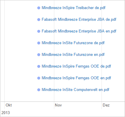
Model: application.models.search + ResultCollection + ResultCollection.Entry
Examples:
<div data-template="timeline"></div>
<div data-template="timeline"
data-height="50px"
data-range-start="2015-01-01"
data-range-end="2015-12-31"
data-date="mes:date">
</div>
Settings:
- data-height: Height of the timeline, auto for automatic adjustment to the displayed results or height indication according to CSS, for example, 200px. Default: auto
- data-range-start & data-range-end: Limits the timeline to a specific time period. The information is converted into a date with new Date (<attributevalue>).
- data-date: Specifies the metadata that is used to position the results on the timeline (default-value: mes:date).
- data-padding-right: Specifies the amount of space to the right to be left empty. (In case the title is not fully visible)
- data-padding-left: Specifies the amount of space to the left to be left empty. (In case the title is not fully visible)
Mustache templates
To display the items in the timeline, mustache templates can be used. More information can be found under results.
view
The view widget defines the basic settings for the search. It does not change the appearance of the page.
Model: application.models.search.input
Examples:
<div data-template="view" data-count="5">...</div>
<div data-template="view" data-count="5" data-constraint="extension:pdf">...</div>
Values:
- answers-count: Maximum number of answers returned by a search.
- similarity-score: Specifies the minimum value of the similarity factor for an answer to be displayed. - Default: "0.5" (50%)
- constraint: Constraint for the search
- count: number of hits
- orderby: Sorting parameters – currently: mes:relevance or mes:date
- order_direction: Determines the order in which the results are arranged.
- Possible values: ascending, descending
- count_filtered_facet_values: Displays the number of unselected filter values. This setting can be set in the editor for the "filteredfacet" component (checkbox at "Show count for unselected filter values") - Default: true
- computed_properties: Returns new generated property at runtime using expression. Example: [{"name": "my_new_property", "expr": "extension"}] - Default: not set
The application object
The application constructor creates an Insight App with the widgets contained in the HTML. Settings as name-value pairs are expected as arguments.
Settings:
- ajaxOptions: A list of properties used by the Ajax channels. Type: object. Properties:
- requestHeaders: Custom headers to be passed in ajax requests. Type: Object or Function.
- Object: { “https://appliance.com”: { key: value, ... } }
- Function: function(channelURL) { return {key: value, …} }
- requestHeadersAsync: Custom headers to be passed in ajax requests asynchronously. Type: Function.
function(url: string, callback: Function):- url: Current request URL
- callback(error: Object, data: Object): A callback function to be called in an async function with the following arguments:
error: should be set to {message: ‘Some error message’} in case of any error occurrence, otherwise set it to NULL.
data: is the list of headers as an object with key, value.
- requestTimeoutInSec: Ajax request timeout in seconds foreach API method. Type: object.
Properties:- search, suggest, preview, export, asyncExport, sourceinfo, usersourceinfo, getprofile, persistedresources, persistedcollections, persistedcollectionschema, personalization, resource.
- genericFallbackTimeout: a custom fallback timeout applied to methods which are not in the list above.
- requestHeaders: Custom headers to be passed in ajax requests. Type: Object or Function.
- apiRequestHeaders: This setting can be used to transfer headers for search queries. Type: Object. e.g: apiRequestHeaders: headers["x-mes-auth-token"]
- applicationId: For differentiation in the app.telemetry, the application can be provided with an ID.
Example: „My Application“
Default value: “Default Application”
Type: String - callback: Function that is called after the initialization of the application. Receives the application object as an argument.
- crossDomainAjax: A list of properties used by the CrossDomainAjaxChannel. Type: object.
Properties:- loggedInHandlerBasePath: The relative URL path to login handler HTML page. Type: string.
Default: “apps/client/loggedin.html” - loginWindowName: windowName parameter of the login window as defined in Window.open() documentation. Default: _blank.
- loginWindowFeatures: a list of comma-separated list of window features for login window as defined in Window.open() documentation. Default: "menubar=no,width=800,height=600,top=100,left=100".
- onLoginAsErrorTreat403as401: When application property “loginAsError” is true and this property is true, treat 403 response HTTP status as 401. Values: true, false. Default value: true.
- treatBasicAuth401as403ForBrowser: Determines whether a 401 response to a Basic Auth request should be treated like a 403 error code. Type: Function. Default: Is enabled for Safari browsers. Return: Boolean.
E.g: function(browserName) { return Boolean; } - onLoginFailedErrorComponent: Currently this is applied to popup blocker error message only. Mode of displaying login errors. Default is Bootstrap modal.
If “onLoginFailed” is set, this has priority over the build in error components.
Values:- “alertComponent”: This requires alert component to be defined in the HTML.
- Any other value falls back to the default value.
- onLoginFailed: Currently this is applied to popup blocker error message only. A callback function to be triggered when a request fails because of authentication. The presence of this callback will disable default login modal errors in the application.
onLoginFailed: function (reason, loginURL, serviceUrl, failedRequest) {}
Callback parameters:- reason: Currently only “PopupBlocker” is available
- loginUrl: The URL to login manually
- serviceUrl: Service URL which failed
- failedRequest: {url: string, retryCallback: function() }, url is the request URL which has failed. retryCallback is a callback to retry the failed request.
- loggedInHandlerBasePath: The relative URL path to login handler HTML page. Type: string.
- contentHighlightRegionsSettings: Defines the highlighting strategy that will be applied on PDF files in the PDF preview. Four strategies are available, where users can decide between the marking of the starting point and end point of a source or the colored highlighting of the source text.
- highlightStrategy: The following strategies are available:
- MARK_START_POS – marks the starting point of a source.
- MARK_END_POS – marks the end point of a source.
- MARK_START_AND_END_POS – marks the starting point and end point of a source.
- HIGHLIGHT_TEXT – applies colored highlighting on the text of a source.
- highlightStrategy: The following strategies are available:
- datasourcesCategoryOrder: List of the data source categories used for sorting the data sources. For unspecified categories, the alphabetical default sorting is used. For example: ["Web", "Microsoft Exchange"]
- datasourcesGroupByCategory: Displays data sources grouped by data source category. Values: true, false. Default value: true
- datasourcesNameOrder: List of the data source name used for sorting the data sources. If datasourcesGroupByCategory is enabled, the data sources are sorted in the groups. For non-specified data sources, the alphabetical default sorting is used. E.g. ["User drive", "Intranet"]
- disableClientNotifications: Disable client notifications. Default value: false.
- disableTemplateEditing: Disables the possibility of mustache customizations in the Insight App Designer. Default value: false.
- editDebounce: Delays the initialisation of the Insight App in the Designer according to the defined value in milliseconds. Default value: 2000. Type: Integer
- enableJumpToAnswer: Enables the jump to answer feature. Default value: true.
- enableProfile: Enables the user profile. Values: true, false. Default value: false
- enableRemoteSources: Enables federated data sources entered in the configuration. Values: true, false. Default value: true
- enablePersonalization: Activates or deactivates personalization on the client. Values: true or false, Default value: true.
- enableHighContrast: Creates a clearer contrast for elements in the Insight app. Default value: false.
- enableImmediateDisplayOfFederatedResults: Do you want to display all results requested by the individual services for federated data sources? This means that results that are less relevant may already be displayed on the first page. Values: true, false. Default value: false
- enableUserSourceInfo: If user-dependent constraints should be available, this option must be enabled, for instance to be able to use the constraint widget:
<div data-template="constraints" data-model="userSourceInfo" data-path="sources.constraints"></div>
Please note that enabling this option can affect performance under certain circumstances.
Values: true, false. Default value: false. - enhancedPDFPreview: In the preview of PDF files you scroll automatically to the most relevant matching result. Values: true, false. Default: false.
- entity: Allows to display entities in different widgets. Type: Object. Default value: Empty
- markAllEntityTypes: Specify whether all available entities should be highlighted in the results. Type: Boolean. Default value: false
- markEntityTypes: Specify which entities should be highlighted in the results. Possible values: ["person", "organization", "misc", "date", "location"]. Type: Array. Default value: Empty. If “markAllEntityTypes” is defined you will see all entities.
- disabled: Allows to disable entities in the following widgets. Type: Object.
- preview: Show entities in the general preview. Type: Boolean.
- pdfPreview: Show entities in the PDF preview. Type: Boolean.
- sampleText: Show entities in the sample text (results). Type: Boolean.
- initAction: The configuration provided here is utilized by the application during its initialization.
- Settings: The settings field is a collection of component-specific configurations. These are conceptually similar to HTML data attributes, but are defined within the application object instead of markup.
- Each setting is defined as a key-value pair, where:
- The key is in the format componentName.camelCaseAttributeName.
- The value specifies the configuration for that component attribute.
- Example:
"view.constraint": { "+=": "datasource/mes:key:<some-value>" }
"preview.mouseOverActionPreviewDelayInMS": 500,
"result.mouseOverActionPreviewDelayInMS": 100,
"answers.pipelineSelectionValue": "answers.pipelineSelectionValue": "<pipelineName>"}
Description | |||||||||||||
Override | The new value fully replaces the existing one and applies to all supported components properties (view.constraint. works only with the strategy “Custom merge strategy” which you can find below). Supported components and properties:
Example: "chatframe.modelId": “abc123” | ||||||||||||
Custom merge strategy | The property value must be provided as an object using one of the supported merge strategies: { "<merge-strategy>": "<property-value>" } Supported merge strategies:
Example: settings: { "view.constraint": { "+=": "datasource/mes:key:<some-value> " } } |
- isParamsUpdateRequired: When set to “true”, the URL will be updated with the current search parameters. This ensures that the search state is preserved when navigating with the back and forward buttons of the browser or reloading the page. Values: true, false. Default value: false.
- linkOpenTarget: Default target option to open links. Values: “_blank”, “_parent”, “_self”, “_top”. Default value: “_blank”
- loginAsError: Login requests are treated as errors. No login is displayed. Values: true, false. Default value: false.
- loginUrl: Can be the full URL of the client service where mashup-login resides or the Client-Service Basepath. If full URL is provided, “mashup-login” path will be appended during the login process. Default value: client.js location + “../../“.
- matchingOptions: Overwrite Optional Terms settings (Default Client-Service Settings). Type Object
- enableOptionalTerms: To display the feature "Misses {Term} - Must Contain {Term}". See Results-Widget. (Default true) Type: Boolean
- optionalTermsRatio: The ratio from when optional terms should be displayed. (Default 0.33) Type: Float
- modelDefaults: An object that contains the default properties for specific models. (Type Object)
- search: Properties specific to the model "search" (Type Object)
- Search request properties such as "properties" are set here.
- search: Properties specific to the model "search" (Type Object)
modelDefaults: {
search: {
properties: { "my_custom_application_property": { "formats": ["VALUE"]} },
computed_properties: [{"name": "my_prop", "expr": 'my_expression'}]
}
}
- msalConfig: A list of authentication configuration (AD FS/AAD) used by the MSAL library to acquire the access token from the Microsoft Identity Platform (e.g. AD FS server or Azure AD).
- Example for AAD:
Mindbreeze.require([..., "msal"], function (..., msal) {
var msalConfig = {
msal: msal,
username: < email_address_of_the_logged_in_user > ,
msalConfig: {
auth: {
clientId: "<OAuth2_Application_ID>",
authority: "https://login.microsoftonline.com/" + "<AAD_Tenant_ID>",
redirectUri: "<OAuth2_Application_Redirect_URI>",
},
},
scopes: [ < configured_scopes > ]
}
var application = new Application({
msalConfig: msalConfig,
...
});
});- Example for AD FS:
Mindbreeze.require(…, "msal"], function (…, msal) {
var msalConfig = {
msal: msal,
username: < email_address_of_the_logged_in_user > ,
msalConfig: {
auth: {
clientId: "<OAuth2_Application_ID>",
authority: "<ADFS_Authority_URL>",
redirectUri: "<Configured_Redirect_URI>",
knownAuthorities: [
"<ADFS_Domain>"
]
}
},
scopes: [ < configured_scopes > ]
};
var application = new Application({
msalConfig: msalConfig,
...
});
}); - Information referring <OAuth2_Application_ID>, <AAD_Tenant_ID>, <OAuth2_Application_Redirect_URI>, <ADFS_Authority_URL>, <Configured_Redirect_URI> ,and <configured_scopes> please refer to the official Microsoft website: https://docs.microsoft.com/en-us/azure/active-directory/develop/msal-client-application-configuration
- To setup your AD FS or Azure AD, please refer to the following documentation.
- Example for AAD:
- onRequestFailed: A function callback to handle request failures. Type Function.
function(errorStatus, requestInfo, retryCallRequest, defaultHandler)- errorStatus: Is an object containing error info such as:
- status: HTTP response status
- reason: String about the reason such as Authentication, RequestFail, PopupBlocker
- retryCount: This is important as counter indicates the number or retries. Please use errorStatus.retryCount to stop triggering retryCallRequest or defaultHandler, otherwise your application might enter into an endless retry loop.
- requestInfo: Object with request information such as: requestUrl, loginUrl or serviceUrl.
- retryCallRequest: The callback to retry last failed request. Type Function: function(headers)
Headers parameter is an object of new headers to be overridden in the new request trial. - defaultHandler: Callback to continue to the default internal application error handling. Type Function.
Usage of onRequestFailed: Important information: Check errorStatus.retryCount and stop retrying by calling defaultHandler or implement your own error handler. Otherwise the request will retry infinitely.
onRequestFailed: function (errorStatus, requestInfo, retryCallRequest, defaultHandler) {
if (errorStatus.retryCount > 5) {
defaultHandler(); // or your own error handler
return;
}
retryCallRequest({
'Authorization': 'abc123'
});
}
- errorStatus: Is an object containing error info such as:
- queryURLParameter: Name of the URL parameter for search terms (e.g. a search for test is started when the page http://www.example.com/?query=test is opened). Default value: empty
- relevanceOptions: Type Object
- termBoostRelativeToPositionInQuery: Options are to generate boost with simple parameters. Value for boost will be between 1.0 and 0.0. Type: Object
- maxTermBoost: Minimum boost that can be assigned, when using generated boost Type: Float
- reductionStep: Step size to decrease at each term, when using generated boost Type: Float
- disablePositionBoostReduction: Set this to True to disable termBoostRelativeToPositionInQuery in general. Type: Boolean
- termBoostRelativeToPositionInQuery: Options are to generate boost with simple parameters. Value for boost will be between 1.0 and 0.0. Type: Object
- rootEl: DOM element that contains the Insight App. Default value: document.body.
- rootEls: List of DOM elements that contain the Insight App. Overwrites the rootEl setting. Default value: document.body
- sources: List of search addresses, e.g. ["<Client Service URL>/api/v2/"]. Default value: Address of the Client Service from which the JavaScript file was loaded. Alternatively, an AjaxChannel / CrossDomainAjaxChannel can be specified instead of the list, e.g. new AjaxChannel({ url: "<Client Service URL>/api/v2/”}), to allow crossDomain requests. AjaxChannel can be required via "service/ajax_channel". When defining a source by an object {url: "<Client Service URL>/api/v2/", channelType: “AjaxChannel”} the channelType property specifies which channel to use. Values: MessageFrameChannel, AjaxChannel, CrossDomainAjaxChannel. Default: CrossAjaxDomainChannel.
- startSearch: Performs a search without a search field. This can be used for example to update blog articles on a website.
- Possible values: true, false.
- Default value: true.
- startSearch = true: A search is triggered automatically even if there is no search field. This is for the case, for example, when blog posts are to be displayed on a website without the user having to explicitly search for them. To use this setting, constraints must be set. If there was a search field, the attribute data-requires-user-input must be set to false for the search to be triggered automatically.
- startSearch = false: A search is not performed automatically even if constraints are set. If a search is still to be triggered automatically, a search input field is required.
- Is set to “false” by default in the standard client because users can trigger a search with a search field.
- searchRequestName: Sets the request (search) name to the specified value. The type is “String” and the default value is “default”. This value can also be set via URL parameter.
- templateResultsEnableAnswers: Disables the answer component. The type is Boolean and the default value is true.
- theme: Customize the application theme by providing custom styles. Type: Object.
{
"version": "1.0",
"elements": {
"entities": {
// …
}
}
}
Read more about theme customization in the .
- titleTemplate: A mustache template can be configured for the title to display the search term (unparsedUserQuery), the title of the current stack element (stackTitle), and the status of the current search (computing). Default value:
{{#stackTitle}}{{stackTitle}} - {{/stackTitle}}{{^stackTitle}}{{#unparsedUserQuery?}}{{unparsedUserQuery}} - {{/unparsedUserQuery?}}{{/stackTitle}}" + document.title + "{{#computing?}} ...{{/computing?}} - updateTitle: When a search is performed, the document title is replaced with the search term used. The document title is shown in the name of the tab. Values: true, false. Default value: true.
- useAvailablePropertiesAsFilters: By default, all available 'Facets' are displayed in the Designer. With this setting it is possible to display all available 'properties' instead of the available facets.
- useLegacyMessageFrameChannel: If set to True, the application uses the legacy MessageFrame channel for built-in sources. This property overrides the backend “Use Legacy Messageframe Channel”. Values: true, false. Default value: false.
- useMessageFrameForNonBuiltinSources: If set to True, the application should use legacy MessageFrame channel for application non-built-in sources. Values: true, false. Default value: true.
Examples:
new Application({});
new Application({
callback: function (application) {
…
},
rootEl: document.getElementById("mySearchApp"),
crossDomainAjax: {
loggedInHandlerBasePath: "apps/client/handle-login.html"
}
});
- queryStringLimit: If the value is greater than 0, then the value defines the maximum length of the generated URL. If the value is not specified or is 0, no maximum URL length is defined.
Example:
new Application( { queryStringLimit:2084 } )
- viewportElement: A HTML element used as a reference for the height and width of an Insight App. This setting is optional, but if activated, it is used for the calculation of the height of the Mindbreeze InSpire AI Chat and the preview.
Functions:
- getUserConstraints(): Returns the current constraits (for use with setUserConstraints)
- setUserConstraints(userConstraints, options): Sets the constraints (for use with getUserConstraints)
- getUnparsedUserQuery(): Returns the current search term, which was entered by the user
- setUnparsedUserQuery(unparsedUserQuery, options): Sets the search term and automatically inserts it into the search field
- getConstraint(): Returns additional constraints (for use with setConstraint)
- getACLConstraint(): Returns additional ACL constraints (for use with setACLConstraint)
The difference between "UnparsedUserQuery" and "Constraints" is that "UnparsedUserQuery" restricts the search fundamentally (via the search field). The constraints are used to refine the search, but do not update the search field.
Examples:
application.setConstraint({ unparsed: "extension:PDF" });
application.setACLConstraint({ unparsed: "%ID:123456" });
Customize Theme
You can customize the Insight Application theme by defining theme properties in application object.
Properties:
- version: theme version. Current version is “1.0”. Required property. Type: String
- elements Type: Object
- entities: For all entities we have colors. For person, organization, date, misc and location we have special colors and for the rest (event custom entities) we use color grey. (Type: Object)
- person: Default background color #f44d6157, tooltip background color: #f44d61
- organization: Default background color #8e7dff5c, tooltip background color: #8e7dff
- date: Default background color #2fbbab57, tooltip background color: #2fbbab
- misc: Default background color #bb702f69, tooltip background color: #bb702f
- location: Default background color #4d74f44d, tooltip background color: #4d74f4
- {customEntityName}: If there are other custom entities configured, you can use the entity name directly to style it. Default background color #5f6d994d, tooltip background color: #5f6d99
- entities: For all entities we have colors. For person, organization, date, misc and location we have special colors and for the rest (event custom entities) we use color grey. (Type: Object)
Each entity contains CSS properties and a tooltip object, where entity tooltip styles are defined.
When no entity custom theme styles are provided, the default styles of the application are used.
- Example:
"person": {
"background-color": "#f44d6157",
// … other CSS properties
"tooltip": {
"background-color": "#f44d61",
"color": "white",
// … other CSS properties
}
}
Telemetry
Improve logging
To improve logging in app.telemetry, there are several URL parameters for it.
- searchRequestName: This parameter can be used to customize the search request name. Type: String, Default: ”default”
- initialQueryTriggerAction: This parameter is used to define the initial query trigger action itself, e.g. if the search is to be triggered by external applications.
Hooks and Extensions
Search Result Transformer
Such transformers in your Insight application will be executed right after the search response. A transformer should return a jQuery deferred object. The transformer function contains the response result in parameters list. Please remember that these transformers will be applied only to search responses.
e.g: var myTransformer = function(responseData) {
return $.Deferred(function() {
var self = this;
// modify your responseData here
self.resolve();
});
}
The list of transformers must be appended to the application.models.search.output.loadTransformers. One way how to do that is by extending the Application and modifying the output model from the prepareModels application function as the following:
Example:
var newApp = Application.extend({
prepareModels: function () {
var myTransformer = function(responseData) {
return $.Deferred(function() {
var self = this;
// modify your responseData here
self.resolve();
});
this.models.search.output.loadTransformers.push(myTransformer);
}
});
Events
Search
Start of search
application.models.search.on("computing", function () {
});
End of search
application.models.search.on("computed", function () {
});
You can use view.el to access the rendered DOM element.
Entity
Mouseover:
- entity:annotation:mouseover: This event is fired at an Entity element when a pointing device (such as a mouse or trackpad) is used to move the cursor onto the element.
Mouseleave
- entity:annotation:mouseleave: This event is fired at an Entity element when the cursor of a pointing device is moved out of it.
Click
- entity:annotation:click: This event is fired at an Entity element when it is clicked.
Examples:
application.views.on("entity:annotation:mouseover", function (data) {
});
Data object:
eventName: Name of triggered event.
view: the view object.
model: Computed model.
targetInfo: The read-only target property of the event.
application: Application object.
Listen to multiple events with start (*) character:You can use star (*) character to listen to multiple events.
application.views.on("*:annotation:mouseover", function (data) {
});
This will listen to all events followed by :annotation:mouseover. E.g
entity:annotation:mouseover
preview:annotation:mouseover
To know which event triggered the current event handler, you can check data.eventName.
More examples:
application.views.on("entity:*:mouseover", function (data) {
});
application.views.on("entity:annotation:*", function (data) {
});
PDF Preview
PDF Preview events:
application.views.on("preview:annotation:mouseover", function(obj){});
application.views.on("preview:annotation:mouseleave", function(obj){});
application.views.on("preview:annotation:click", function(obj){});
Read more details in the section.
Component rendering
After render:
After a widget is rendered a “afterRender:{Widget name}” is triggered.
application.views.on("afterRender:Result", function(application, model){});
Actions
Links and buttons can trigger actions in the Insight App with the attribute data-action-object. For example,
<a data-action-object="{"openSearch":{}}"
data-href="https://duckduckgo.com/?q={searchTerms}">
Bei DuckDuckGo suchen
</a>
openSearch
The openSearch action searches the current term using an external search engine, such as Bing, DuckDuckGo, Google or Yahoo.
Attribute:
- data-href: the address of the external search engine with placeholders for the search term {searchTerms} and language {language}.
Options:
searchTerms: additional restrictions on the search terms can be added, for example, "{searchTerms} image" searches for the current term and the word image
Examples:
<a data-action-object="{"openSearch":{}}"
data-href="https://duckduckgo.com/?q={searchTerms}">
Bei DuckDuckGo suchen
</a>
<a data-action-object="{"openSearch":{}}"
data-href="https://www.bing.com/search?cc={language}&q={searchTerms}">
Bei Bing suchen
</a>
<a data-action-object="{"openSearch":{"searchTerms": "{searchTerms} Bild"}}"
data-href="https://duckduckgo.com/?q={searchTerms}">
Bei DuckDuckGo suchen
</a>
exportResults
The exportResults action opens a new stack, to export the current search.
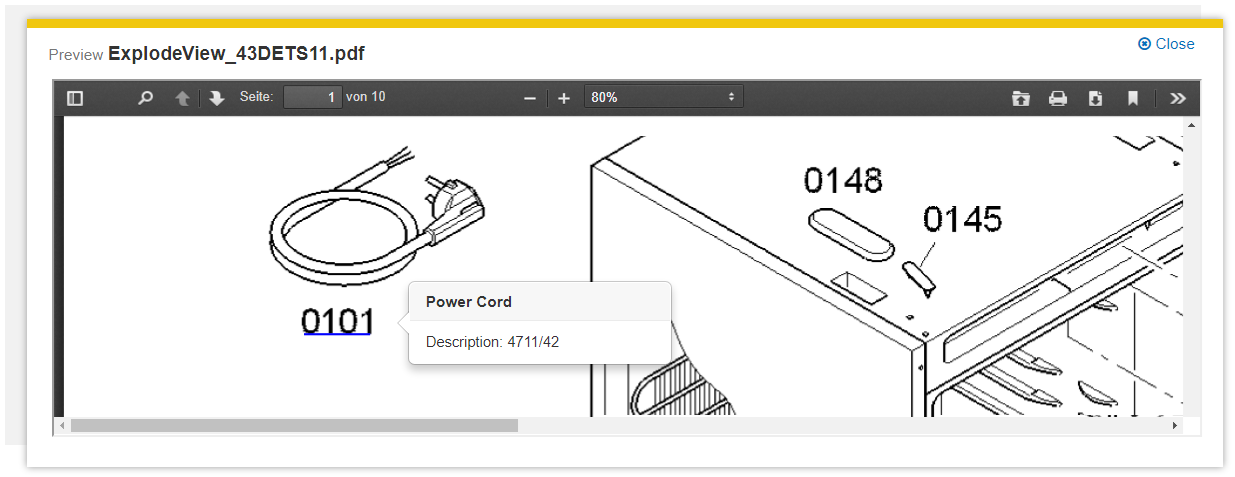
Attribute:
- data-properties: List of default export properties
- data-export-enabled: Activate or deactivate the export feature
Examples:
<button
class="btn hidden-when-mb-stack-has-child btn-export mb-no-print"
name="export"
data-action-name="exportResults"
data-properties="title,mes:date,mes:size,action_0"
data-export-enabled="true">Export
</button>
PDF Preview Interactions
An API extension allows developers to react to hyperlinks in the PDF preview. For example, an interactive tooltip for a component in a technical drawing can be displayed.

Events:
application.views.on("preview:annotation:mouseover", function(obj){});
application.views.on("preview:annotation:mouseleave", function(obj){});
application.views.on("preview:annotation:click", function(obj){});
Examples:
<div data-mb-exclude="true">
<script type="text/x-mustache-template" id="linkoverlayinfo">
<div>{{name}}</div>
</script>
</div>
application.views.on("preview:annotation:mouseover", function(obj){
dataObject = {
name: "My Value"
}
var model = new Backbone.Model(dataObject);
var innerHTML = document.querySelector('#linkoverlayinfo').innerHTML;
var mustacheTemplate = new Mustache(innerHTML);
var str = mustacheTemplate.render(model);
});
Default Action-Type for custom actions:
If you want the custom action to be visible in app.telemetry, you can specify the value "actionType" as argument. The following values are allowed: "preview", "openHref", "vote", "sendFeedback" , “customAction”:
<a data-action-object="{"myCustomAction":{ "actionType": "preview" }}">
Open custom preview
</a>
A click on "Open custom preview" executes the function "myCustomAction" and sends a "personalization" request.
Key combinations
Using the attribute data-shortcut, key combinations for areas and actions can be set. If the attribute is set to a button or link, this is executed when you press the key combination. For all other elements, the element is focalized. If the element itself is not focusable, the first focusable element contained will be focalized.
For the key combination, the following keys are available in the order indicated:
- alt
- ctrl
- meta
- shift
- Character/Number
Examples:
<div data-shortcut="alt+5">
…
</div>
<button data-shortcut="alt+shift+s">Aktion</button>
<button data-shortcut=" ctrl+meta+shift+x">Aktion</button>
CSS
The Mindbreeze InSpire Client uses Bootstrap Version 2.2.2 (http://getbootstrap.com/2.2.2/) for the design of the user interface.
The basic framework forms a two-column layout with the following structure (http://getbootstrap.com/2.2.2/scaffolding.html#fluidGridSystem):
.container .row-fluid
.span9
.span3
Icons, such as the magnifying glass in the search field, are transcribed with an icon font, which enables the colors to be changed easily. The icons are integrated with elements such as <i class="icon-search"></i>, making it possible to exchange the icon font for your own implementation. The utilized library is Font Awesome (http://fortawesome.github.io/Font-Awesome/3.2.1/).
h2-elements are used as headers for the main areas.
The description of the numbering is as follows:
- Search field
The following elements are available for the design of the search field:
form.search-field
input
button - Results
For the results, the structure of the media object-components (http://getbootstrap.com/2.2.2/components.html#media) is used:
.media
.media-heading
.media-object
.media-body - Filter
For Filter, the structure of the stacked pills components (http://getbootstrap.com/2.2.2/components.html#navs) is used:
.nav.nav-stacked.nav-pills
The titles of the results are h3-elements.
For elements that can be expanded and collapsed, the structure for the ARIA roll tablist + multiselectable is used (http://www.w3.org/TR/wai-aria/roles#tablist).- Title collapsed
.mb-role[role=tablist][aria-multiselectable=true] [role=tab] - Title expanded
.mb-role[role=tablist][aria-multiselectable=true] [role=tab][aria-expanded=true]
- Title collapsed
- Search Tab
For the search tab, the structure of the Basic Navbar components
(http://getbootstrap.com/2.2.2/components.html#navbar) is used with Nav links:
.navbar .nav - Header
For the header, the structure of the Basic Navbar components
(http://getbootstrap.com/2.2.2/components.html#navbar) is used with Nav links:
.mb-header.navbar.navbar-inverse .mb-top-menu .nav
mb-computing
While a search is being performed, the widgets obtain the CSS class mb-computing. Use this CSS class to show the activity.
Examples:
<div class="mb-progress-indicator mb-absolute mb-center"><i class="icon-spinner icon-large"></i></div>
.mb-progress-indicator {
display: none;
}
.mb-computing .mb-progress-indicator {
display: block;
}
Custom styles for the Outlook plugin
Mindbreeze customers can download the latest Outlook plugin via Updates & PI. Here you will get a zip file which contains a resources folder. Inside this folder you will find the file custom.css which can be used to style the Outlook plugin. By default, the Mindbreeze style is applied.
Please prefix your styles with the class “.outlook” in the custom.css file (also see the custom.css file in MindbreezeOutlookAddin-<RELEASE_VERSION>.zip\resources\custom.css after unzipping the downloaded plugin from Updates & PI). The custom styles are visible after you upload the plugin zip file to the Mindbreeze Management Center.
"
.outlook .my-style {
padding: 0 0 0 0.
}
"
To upload the file into the Mindbreeze Management Center please log in to your appliance. Then select the menu item “Configuration” in the side navigation. Go to the tab “Plugin” and upload the zip file with the changed custom.css file.
The changes will apply to the Mindbreeze Outlook Add In automatically after you close and re-open Outlook.
Developing your own custom widgets
Your own widgets can be installed as plugins and be used by you as your own Insight Apps and in the Insight App designer.
Example plugin
Once the plugin has been downloaded, it can be adjusted (see from Plugin structure onwards) and uploaded again under "Plugins". Once the plugin has been activated under "Client-Service“ > “Client Resources ", it is in the editor and ready for use.
Plugin structure
Mindbreeze plugins are zip files that contain a description in the plugins.xml. The element id contains a clear string for the plugin, and mindbreeze.webapp.Resources is the extension point used. resource_path specifies the path inside the plugin, where the files are stored.
<?xml version="1.0" encoding="utf-8"?>
<Plugins>
<version>
<major>1</major>
<minor>0</minor>
<micro>0</micro>
<id>0</id>
</version>
<id>myorganization.example</id>
<plugins>
<Plugin>
<kind>RESOURCE</kind>
<extension>
<Extension>
<point>mindbreeze.webapp.Resources</point>
</Extension>
</extension>
<resource_path>resources</resource_path>
</Plugin>
</plugins>
</Plugins>
Resource proxying
Using Mindbreeze resource plugins, the Mindbreeze Client Service can also act as a proxy for remote Web resources.
To make remote resources accessible for Insight Apps, a <resource_destination> element must be added to the plugin configuration:
<?xml version="1.0" encoding="utf-8"?>
<Plugins>
<version>
<major>1</major>
<minor>0</minor>
<micro>3</micro>
<id>0</id>
</version>
<id>remote.resource</id>
<plugins>
<Plugin>
<kind>RESOURCE</kind>
<extension>
<Extension>
<point>mindbreeze.webapp.Resources</point>
</Extension>
</extension>
<resource_destination>
<base_url>https://www.myserver.com</base_url>
<request_headers>
<KeyValuePair>
<key>User-Agent</key>
<value>curl/7.19.7 (x86_64-redhat-linux-gnu) libcurl/7.50.0 OpenSSL/1.0.1e zlib/1.2.3 libidn/1.18</value>
</KeyValuePair>
<KeyValuePair>
<key>CustomHeader</key>
<value>CustomValue</value>
</KeyValuePair>
</request_headers>
<request_query_parameters>
<KeyValuePair>
<key>QueryParam1</key>
<value>Value1</value>
</KeyValuePair>
</request_query_parameters>
</resource_destination>
</Plugin>
</plugins>
</Plugins>
A “resource_destination” element contains a “base_url” element. The base URL for the remote resources is configured here.
HTTP requests in the form of <InSpire_searchapp_base_url>/resource/<plugin_id>/path are redirected to <base_url>/path.
For example, with the “remote.resource” plugin (see plugin configuration above) requests to https://inspire.mindbreeze.com/searchapp/resource/remote.resource/api are sent to https://myserver.com/api.
The <request_headers> element can also be used to determine which HTTP headers are to be set in the redirected HTTP requests. HTTP header names and values can be stored as “KeyValuePair” elements, like the User-Agent or CustomHeader headers in our example.
Similar to headers, HTTP query parameters can also be configured with KeyValuePair elements. These must be located in a “request_query_parameters” element.
Creating your own widgets
Templates.View.extend creates a new view. These are Backbone.Views with extensions. To create a custom view, use Templates.View.extend:
var MyView = Templates.View.extend({ … });
At extend, the custom functions are transferred. The main features include:
initialize | Retrieved when creating the view. Always start by calling up Templates.View.prototype.initialize.apply[this, arguments]), so that the groundwork is done. |
setModel | Retrieved when you change the model. Can be opened in Designer even during operation. Deleting a View will call up setModel is called with a null model. The procedure consists of: 1. Cleaning up dependencies to the current model 2. Templates.View.prototype.setModel.apply(this, arguments(this, arguments) 3. Create Event Handlers and other dependencies for the new model |
render | Used to customize the HTML. The DOM element is available under this.el as a jQuery object under this.$el. |
remove | Opened when deleting the View. At the end always open Templates.View.prototype.remove.apply(this, arguments, so that the groundwork is done. |
Registering your own widgets
After creating your own widget it needs to be registered so that it is available in Insight Apps and in the Designer. To do this, use Templates.add:
Templates.add({
name: "exampleresults",
view: MyView,
attributes: {
size: {
title: " myorganization_results_size",
type: "string",
defaultValue: "test"
}
},
designer_menu: [{
name: " myorganization_results",
icon: Mindbreeze.require.toUrl("myorganization.example/example.png"),
description: "myorganization_results_description",
group: {
name: "mygroup",
description: "mygroup_description"
}
}]
});
});
Options:
name | Name of the widget. This can be used in Insight Apps data-template="exampleresults". Required field |
view | View object, see section. Required field |
attributes | Description of the available options. Used in Designer and for the options of the View. |
designer_menu | Menu items for the Designer. |
Attribute
When you register your own widgets, you can use the property attributes to transfer options to the widget, for example:
attributes: {
size: {
title: "myorganization_results_size",
type: "string",
defaultValue: "test"
}
}
- If it’s usable in the HTML as data-size:
<div data-template="exampleresults" data-size="mysize"></div>
- then in the widget, the option is automatically available:
var MyView = Templates.View.extend({
…
initialize: function () {
console.log(this.options.size); // logs mysize
},
…
});
The title for the designer is specified with title. If the text is included in the translations, it is automatically translated.
The following types are available in types:
string | Strings |
boolean | true/false |
int | integers |
date | Date values that can be parsed with new Date(<value>). For example, 25 Dec 1995 13:30:00 GMT |
list | JSON array or comma- separated list of string values. ["a", "b", 1] or a, b |
i18nString | Values that begin with i18n. are translated. |
QueryExpr | The string is stored as an unstructured search Unstructured Search. |
With defaultValue, a default value can be specified to be used if the Option was not set.
Display in Designer
When you register your own widgets, menu options for the widget can be filed in Designer with the property designer_menu menu options; for example:
designer_menu: [{
name: "myorganization_results",
icon: Mindbreeze.require.toUrl("myorganization.example/example.png"),
description: "myorganization_results_description",
group: {
name: "mygroup",
description: "mygroup_description"
}
}]
With the following translations:
i18n.loadExtension({
mygroup: {
"de": "Meine Gruppe",
"en": "My Group"
},
mygroup_description: {
"de": "Meine Gruppe macht ...",
"en": "My Group takes care of...."
},
myorganization_results: {
"de": "Resultate",
"en": "Results"
},
myorganization_results_description: {
"de": "Anzeige von Resultaten",
"en": "Result Display"
},
myorganization_results_size: {
"de": "Größe",
"en": "Size"
}
});
This menu appears:
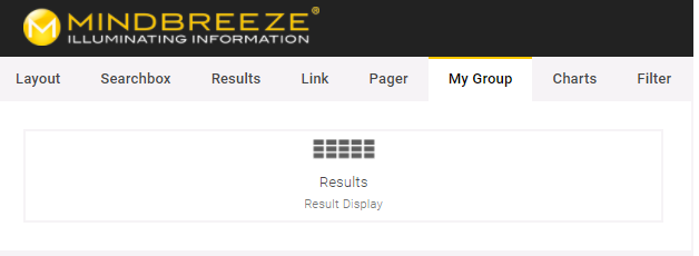
Options:
name | Automatically translated name |
icon | Address of an image. Mindbreeze.require("<plugin-id>/<Pfad>") delivers the path of a file in the plugin |
description | Detailed description of the widget |
group | Name (name) and description (description) of the group in which the widget is to be sorted. |
Adding Translations
With i18n.loadExtension your own translations can be added:
Mindbreeze.require(["i18n/i18n"], function(i18n) {
i18n.loadExtension({
mygroup: {
"de": "Meine Gruppe",
"en": "My Group"
}
});
});
Development environment
Prerequisites:
Apache Ant | |
Node JS |
Folder structure:
build.xml | Retrieved with ant. Combines all dependencies in a new JavaScript file and packetizes the plugin. |
build.js | Configuration for packetizing plugin. Uses require.js |
src/css/plugin.css | |
lib | |
lib/r.js | Optimizing script |
lib/text.js |
In order to develop the plugin without installation, it can be stored on a web server and loaded using the following JavaScript:
<script src="https://demo.mindbreeze.com/public/apps/scripts/client.js"></script>
<!-- load plugin during development -->
<script>
window.define = Mindbreeze.define;
Mindbreeze.require.config({ paths: { "myorganization.example": "/plugins/myorganization.example/src" }});
Mindbreeze.require(["myorganization.example/init"]);
</script>
<!-- load plugin during development (end) -->
<script>
Mindbreeze.require(["client/application"], function (Application) {
new Application({
…
})
});
</script>
It is important that the plugin and the Client.js both stem from the same server.
CMIS RSS feed interface
Mindbreeze offers you the possibility of performing the search in the form of a dynamic RSS feed. To do this, open the URL below:
https://YourAppliance/mindbreeze/cmis/content/query?q=ALL&qtype=mes:sanskrit&maxItems=5&skipCount=5&language=de_DE
The following section describes the URL parameters and their function
Parameter | Optional | Description |
q | No | Search term – the entire search language can be used |
maxItems | Yes | Number of search results. Default value: 5 |
skipCount | Yes | Number of results to be skipped. This parameter can be used for scrolling. e.g. skipCount=5, in order to get to the second page with maxItems 5. Default value: 0 |
language | Yes | This parameter controls the translation of the metadata. Example: language=de Default value: Language of the browser |
Running Insight Apps through the client service and changing the default Insight App
To run your own Insight App directly via the client service and also configure them there as a default, the following parameters can be configured in the menu item "Web Application Contexts Settings" in the client service configuration. The corresponding files should then be copied to the appropriate location via the InSpire file uploader.
URL Path | URL path of the Insight App. |
File Path | URL path of the Insight App. |
Override Existing Path | If enabled, you can overwrite threads that normally exist in the standard client. This setting can cause standard applications to stop working in the usual way. |
Allow Symlinks | If enabled, symbolic links can also exist in the displayed threads. |
Authenticated URL pattern | The pattern determines the request URLs for which filters (which perform authentication, among other things) are applied. Usually the pattern contains the entire Insight App (standard pattern: /* ). For reasons of performance, however, URLs with static content (e.g. images, CSS or Javascript libraries) should not be included in the pattern. The pattern must be relative to the URL path and match the Tomcat web.xml URL pattern. [Servlet 3.0 specification] If the pattern is empty, no filters are applied and the Insight App can only be used without user authentication. |
Login URL pattern | If “optional” is selected in the “Require Authentication” field, a user authentication is requested for all request URLs that correspond to this pattern (the pattern must be relative to the URL path). The pattern must match the Tomcat web.xml URL pattern. [Servlet 3.0 specification] |
Not Cached MIME-Types Pattern | Basically, all resources in "Authenticated URL pattern" are cached by the browser. With this option certain resources can be explicitly excluded. This option defines a regular expression that is matched against the MIME-type of the resource. Resources with matching MIME-types are explicitly not cached. For example, by default, the index.html is not cached because the index.html can contain personalized values. default value: text/plain|text/html|application/json |
[Servlet 3.0 specification] http://download.oracle.com/otn-pub/jcp/servlet-3.0-fr-oth-JSpec/servlet-3_0-final-spec.pdf
The default Insight App is available as a template at /data/apps/client/index.html.
In the following example, two Insight Apps (marketing and sales) are configured on the client service, which can be reached at https://search.myorganization.com. The Insight App marketing can then be found at https://search.myorganization.com and https://search.myorganization.com/apps/marketing and the Insight App sales at https://search.myorganization.com/apps/sales.
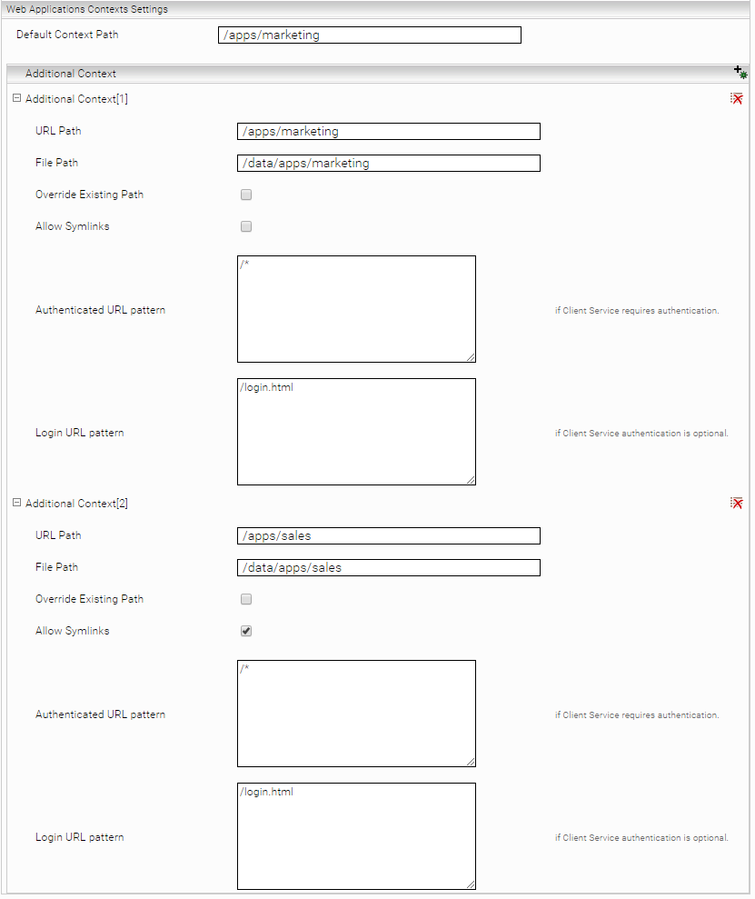
Appendix
Source Info Cache
The source info is retrieved when the Insight App is loaded using a POST request to /api/v2/sourceinfo. This contains information about data sources and API endpoints. For performance reasons, it is cached on the server side. To refresh the cache, the HTTP header "x-mes-refresh-cache" must be set, e.g:
curl -k -H "x-mes-refresh-cache:refresh" -X POST --data "{}" https://<your_appliance>:<your_client_port>/api/v2/sourceinfo
Embedding Insight Apps with Iframes and Content Security Policy
If Content Security Policy is used on a web server and resources are integrated from a Mindbreeze InSpire using, for example, an iframe, it is necessary to adapt possible Content Security Policy headers so that the resource is allowed be loaded by the web browser.
The following Content Security Policy header is very restrictive. A frame-src parameter must be specified here to allow access to the resources of Mindbreeze InSpire, accessible at https://search.mindbreeze.com.
Content-Security-Policy: default-src 'none'; frame-src https://search.myorganization.com
or
Content-Security-Policy: default-src 'none'; frame-src https://*.myorganization.com